Appearance
CRM Build Guide
In this guide, we’ll cover how the CRM Template was built and how to tailor it to your needs.
The template includes 5 groups of pages:
- Signup/signin
- Deals
- Companies
- Contacts
- Settings
I’ve connected my app to a Xano backend, but you can choose the one of your choice.
Let’s dive into more details on how each page was built.
Assets
- CRM Template
- Starter Kit Library is imported by default in the template.
- Example database
- Xano snippet
- Supabase (coming soon)
- Figma mockups (coming soon)
Data structure
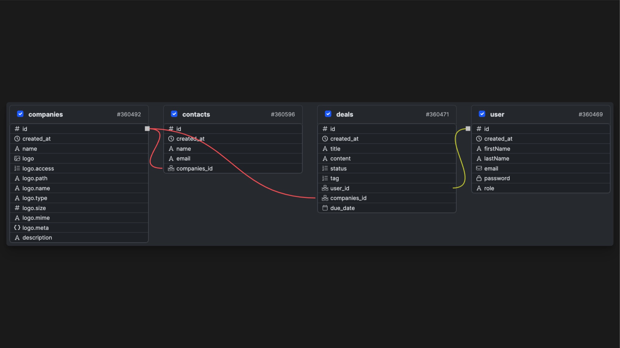
Deals
The deals are all the commercial opportunities that a CRM stores. They’re linked to users and companies.
idintegercreated_attimestamptitletextcontenttextstatustexttagpassworduser_idintegercompanies_idintegerdue_datedate
Companies
Every CRM revolves around deals that are tied to a contact and a company. That’s why we have to store companies in a separate table, as some deals can be linked to the same company.
idintegercreated_attimestampnametextlogoimagedescriptiontext
Contacts
A contact is the person attached to a deal, that’s also part of a company. In the case of a CRM, that’s the person you’re “trying to close” on a deal.
idintegercreated_attimestampnametextemailtextcompanytext
User
The user table store the information about the users of the application. This is where we the information goes when a new user signs up.
idintegercreated_attimestampfirstNametextlastNametextemailtextpasswordpasswordroletext
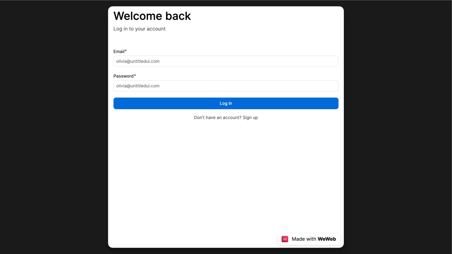
Sign in / Sign up Pages
These pages allows your users to sign up, sign in and reset their password.
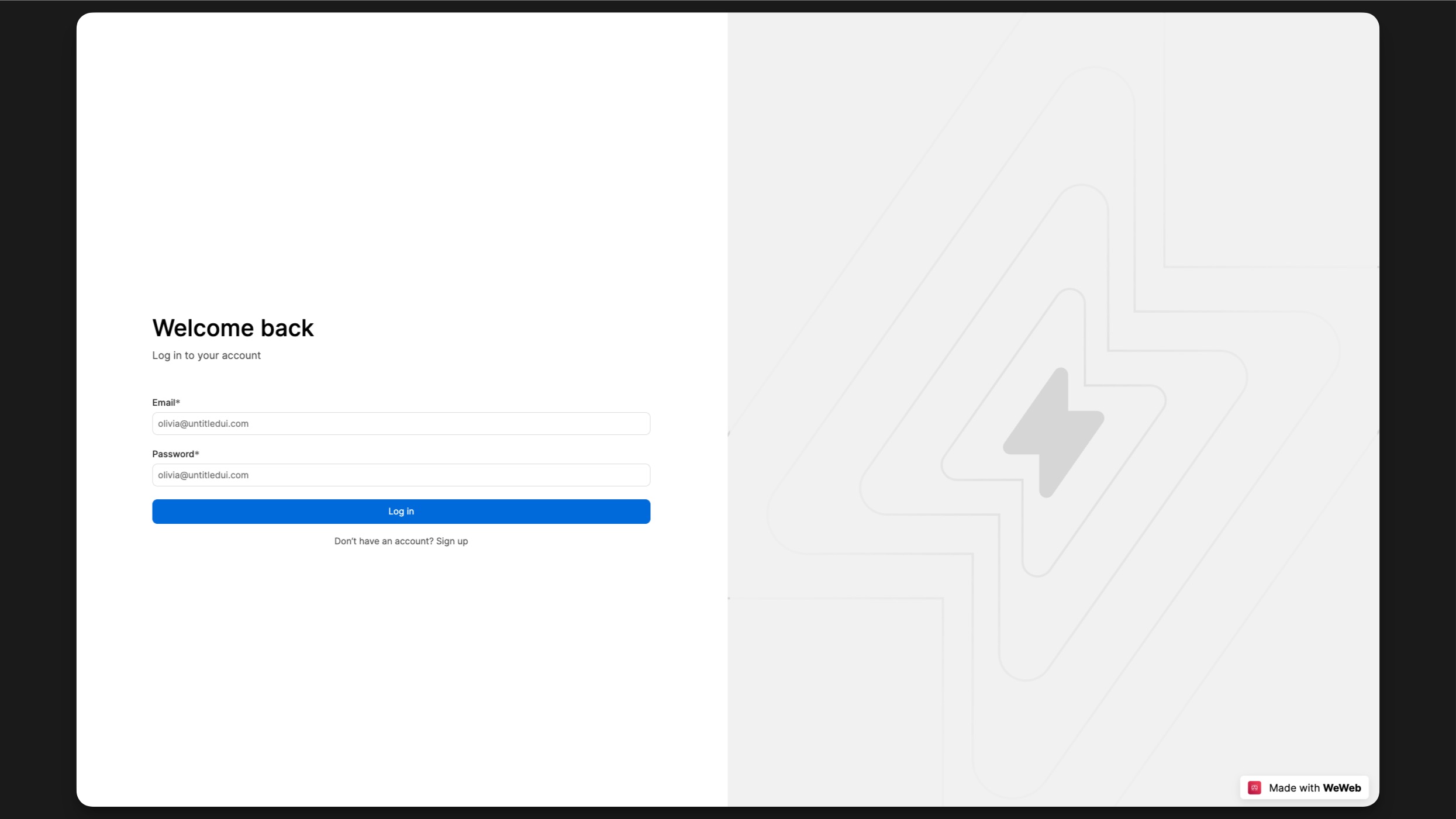
The Inputs and Button are components from the Starter Kit. You can change their settings in the properties panel.
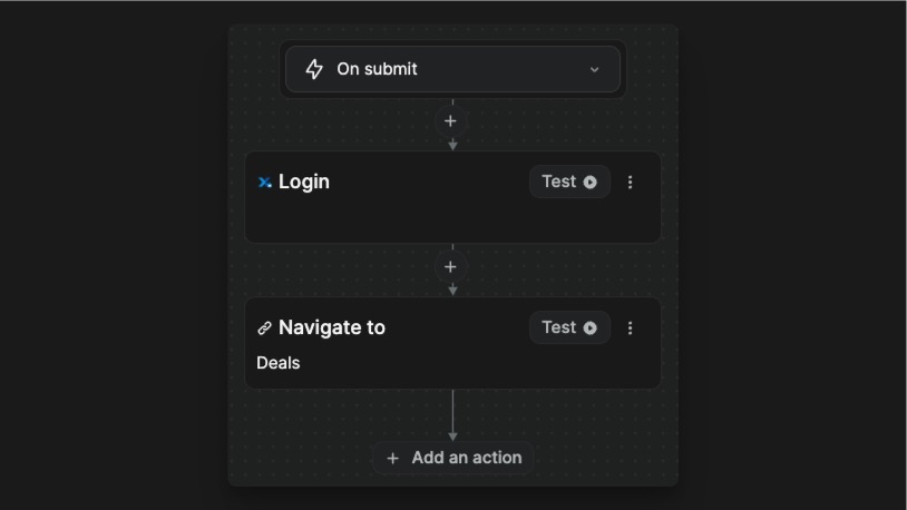
The Form container, that holds the inputs and buttons, has a workflow Sign in. This workflow is triggered when the form is submitted.
The Sign up page was built the same way as the Login page, with a few more inputs and a Sign in workflow.
Those 2 pages are responsive. In tablet breakpoint, the left content takes up the whole width and the right content is hidden.
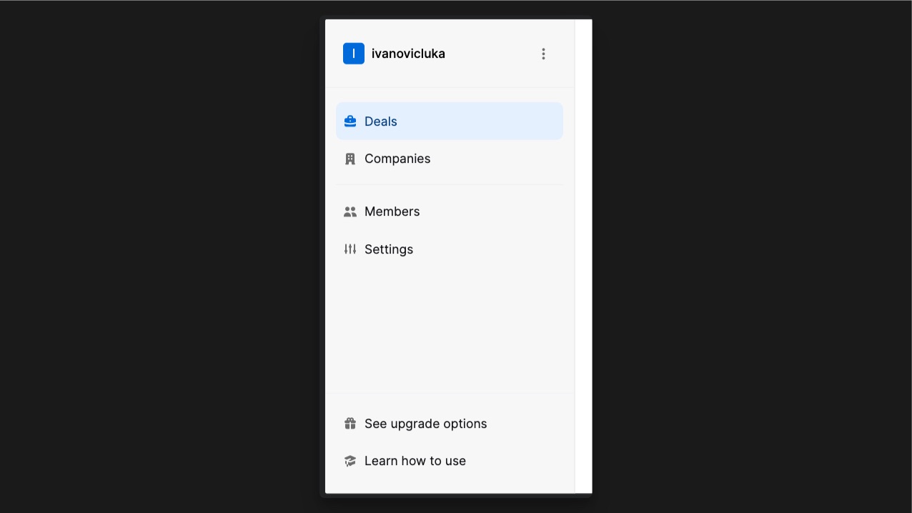
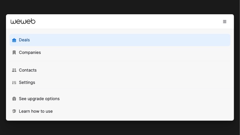
Sidemenu
The Sidemenu contains Item Link components. If you edit the component (1), it will automatically update all instances of it throughout the Sidebar, except the properties that you apply directly on the instance such as its link and its props (2). 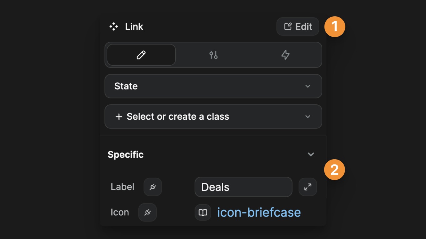
The Sidebar component comes with an integer variable menuWidth (located in the Sidemenu folder of the Variables panel). This variable is connected to the width of the Sidebar in the desktop breakpoint. It also defines the left padding of the Deals section.
The Sidemenu component is responsive by default! In tablet breakpoint, the sidemenu will be hidden by default, and can be activated with the menu icon in the top menu.
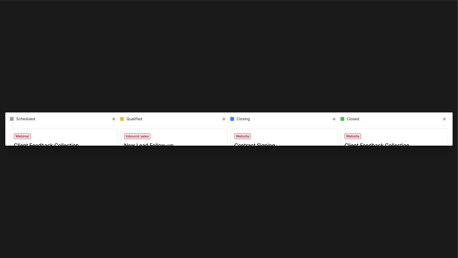
Deals page
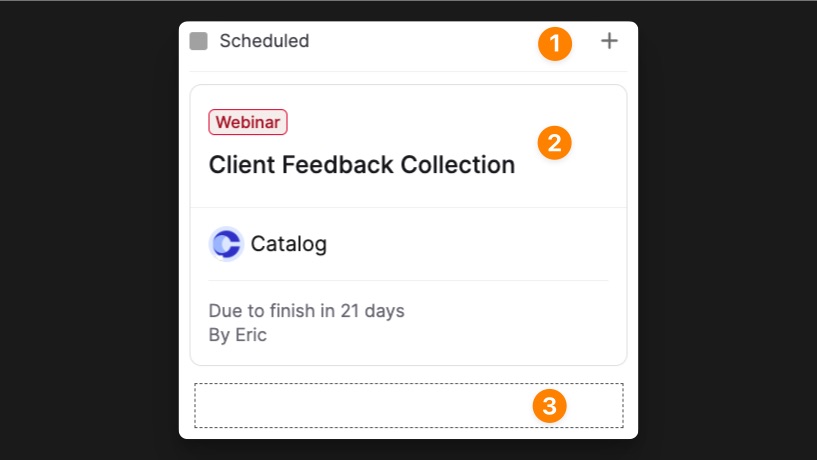
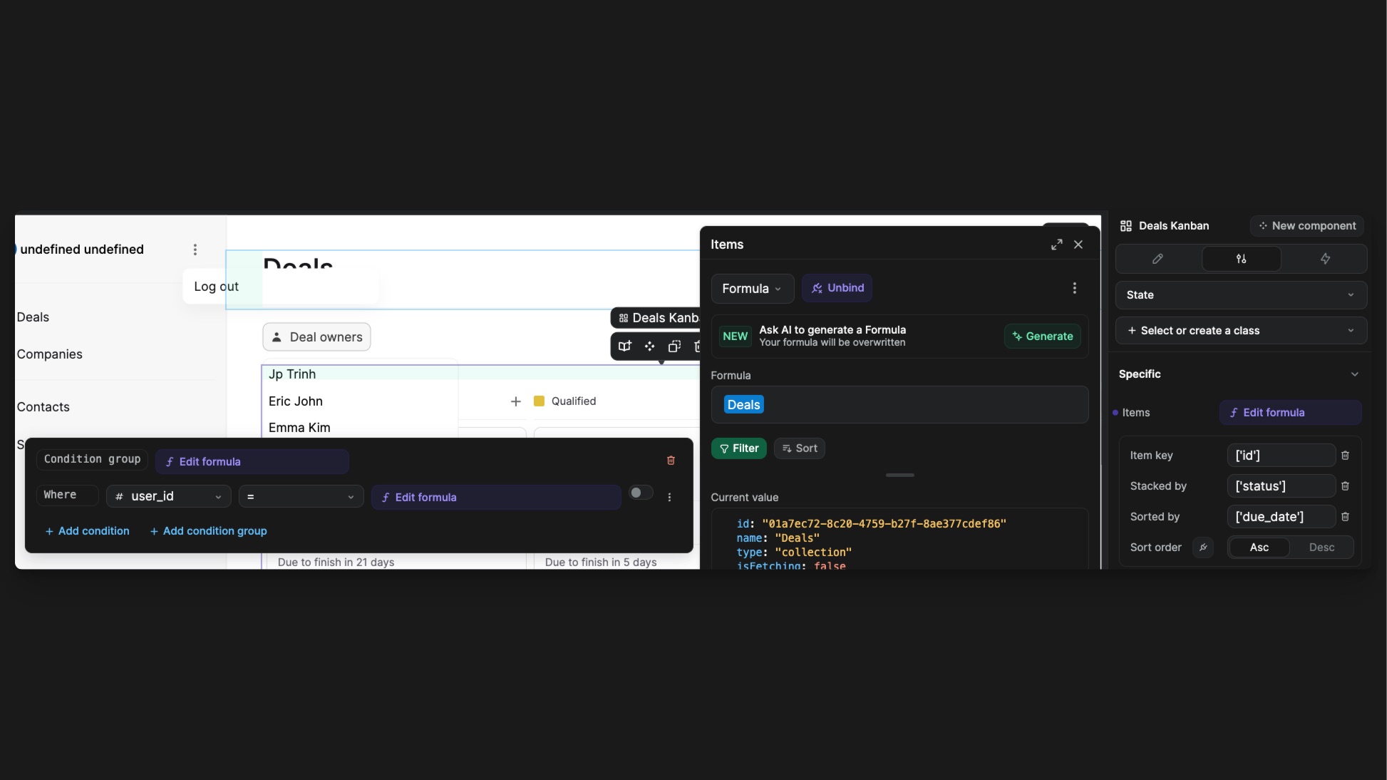
This is the page where your user will be able to create and manage deals.The main component on that page is the Kanban.
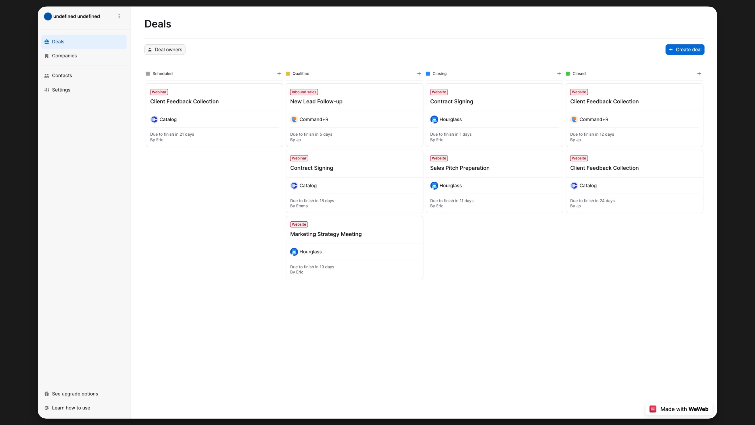
A Kanban is made up of Column stacks where the cards can be moved to. In each columns you’ll find: a Header (1), an Item div (2) and a Footer (3).
Bind data to the Kanban
The Kanban component is linked to our Deals collection. So each Item of the Kanban will be repeated for each Deal inside of that collection.
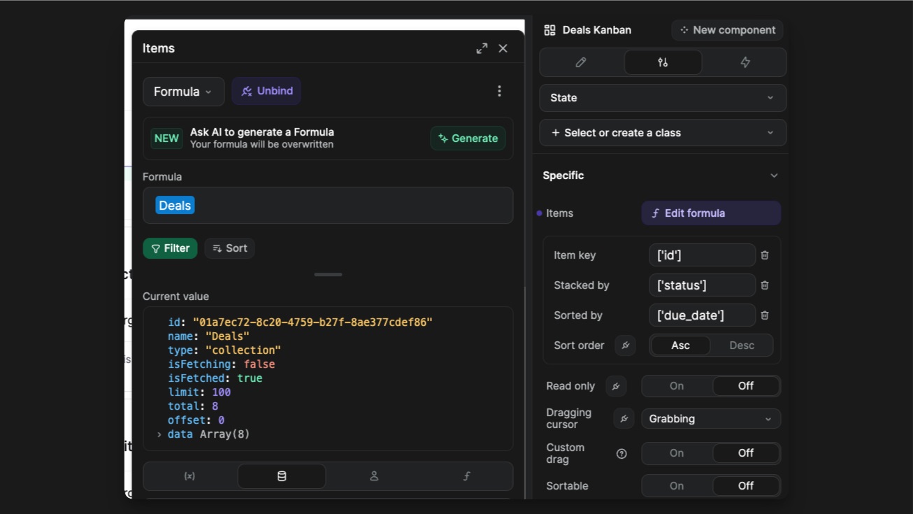
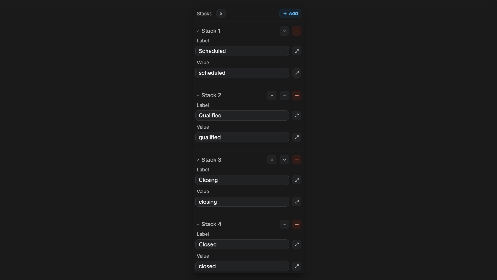
In the properties pannel, you’ll find a Stacks properties where you can define what column exists in your component. The value of the Stack by needs to match the value of the Stack in order. In this case, it’s the value of my item’s status.
Customize the Kanban
- Cards
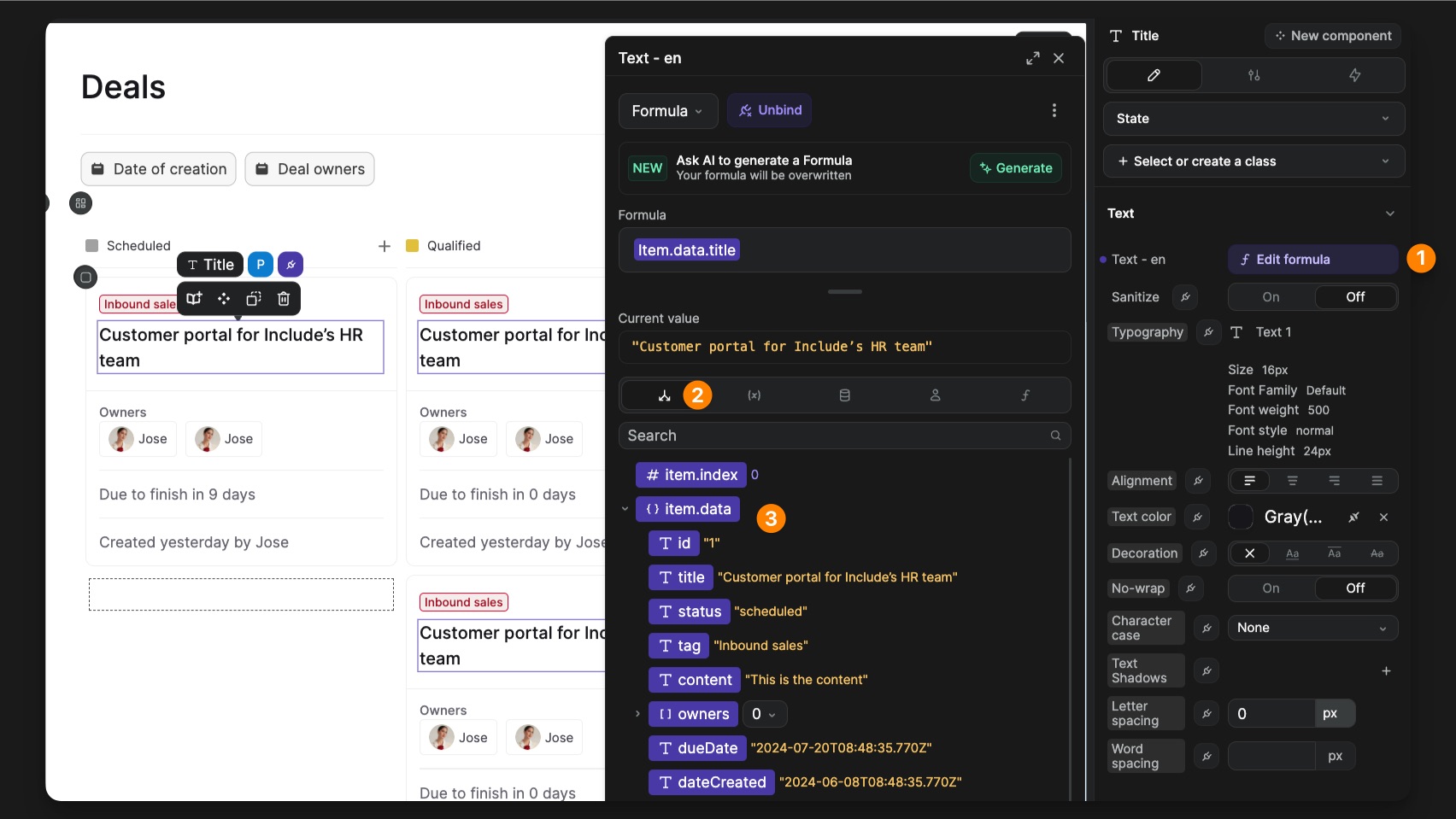
When you select any element inside of a card, you’ll see that its content is bound to a formula (1). On the first tab of the formula pannel (2), you have access to the context where you can find all the properties of the current deal.
- Header
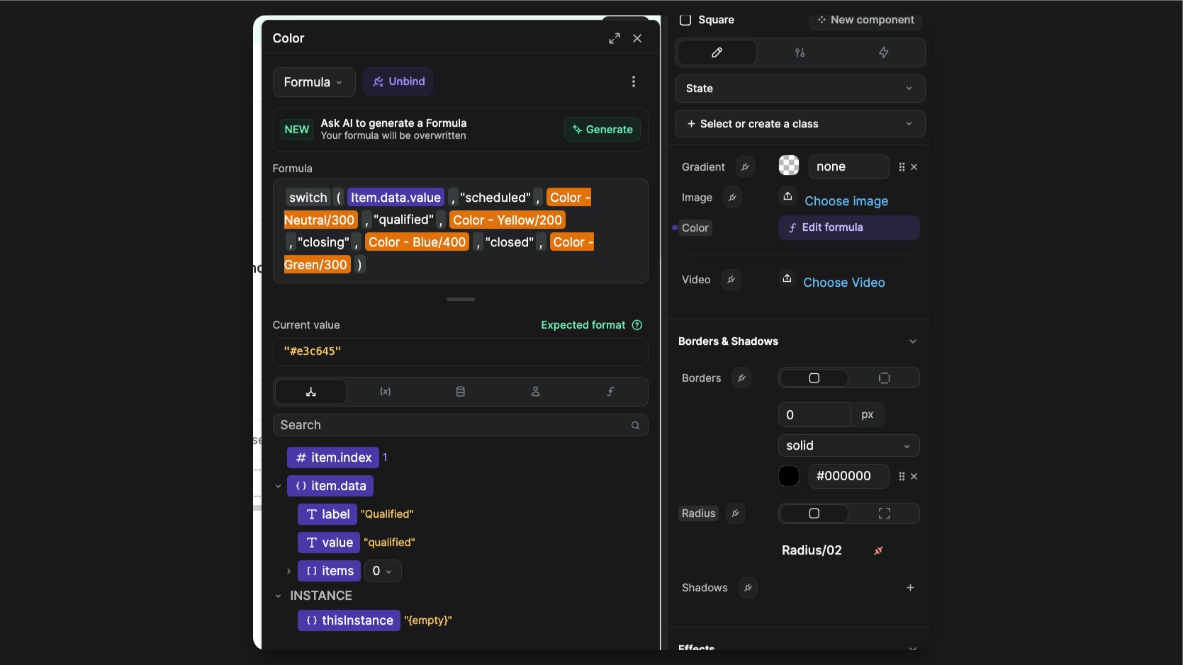
The color property of the Square element is bound to a Switch formula that determines the background-color depending on the status.
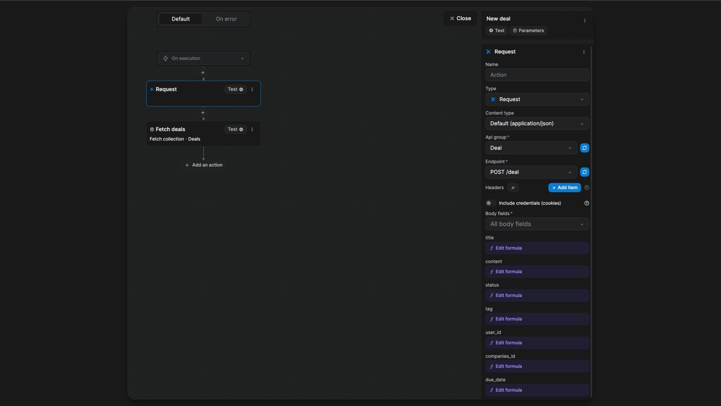
Add a deal
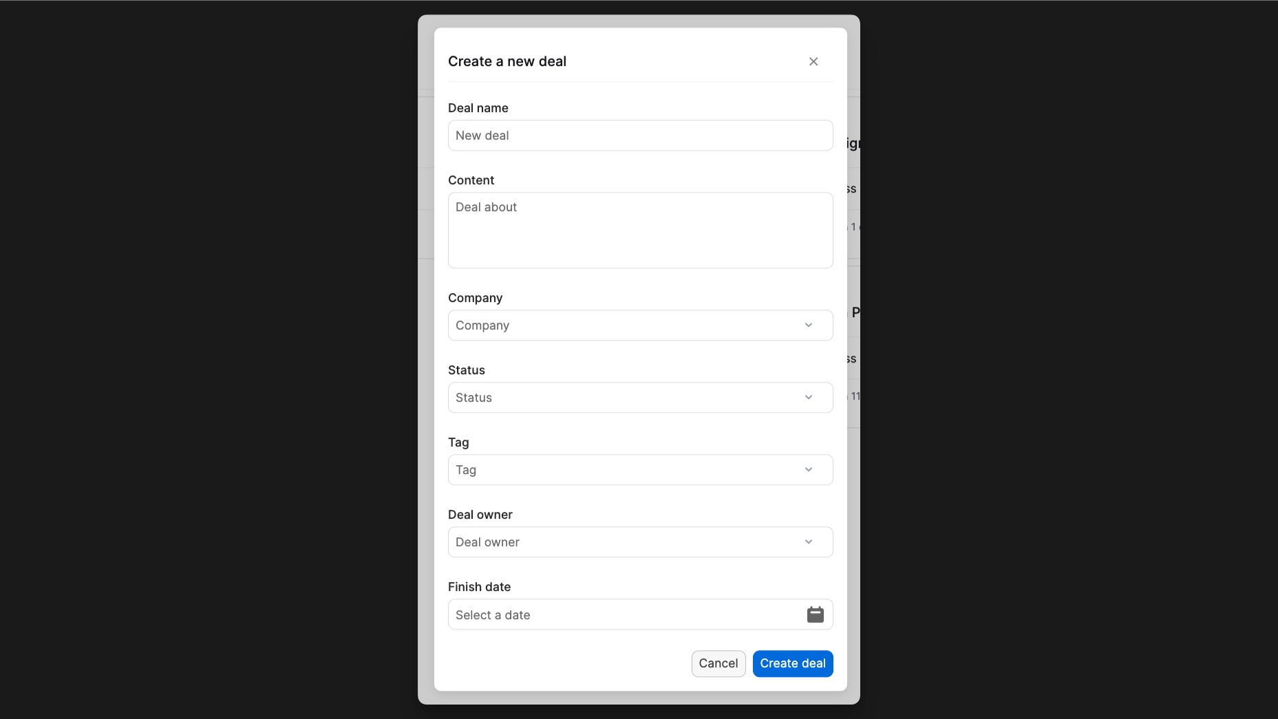
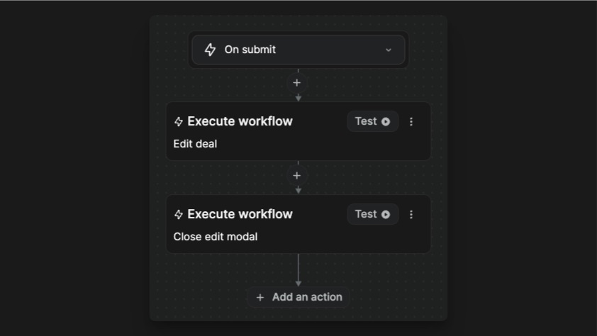
To add a new deal, you can click on the Create deal button. It will display a modal containing a form. This button triggers workflow that opens the New Deal Modal.
On submit, that form takes all the information from the inputs in the forms and sends them to the backend. At the end of the workflow, the modal is closed.
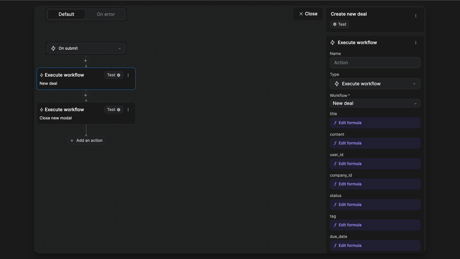
This nested workflow is a global workflow. This method allows us to have one workflow that can be used at multiple places but managed in one. When you define a global workflow, you can set parameters to be used inside it. This is useful to add different variables and values in different situations.
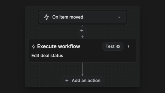
Change status
The Kanban component has a trigger On item moved that detects when the user moves a card. Each time this trigger is fired, we are sending the data to the backend to save the new status of the card.
Display a deal in a drawer
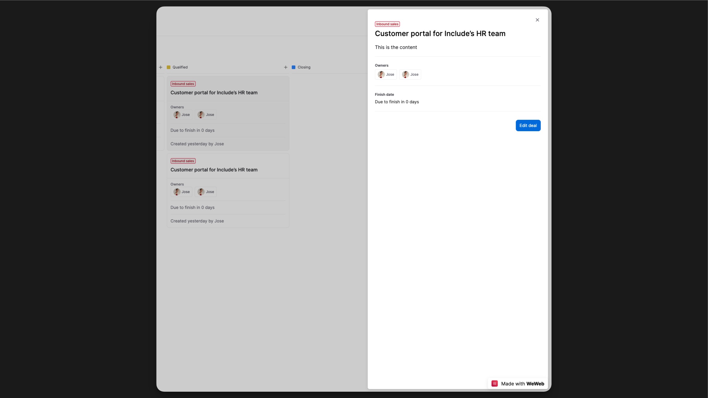
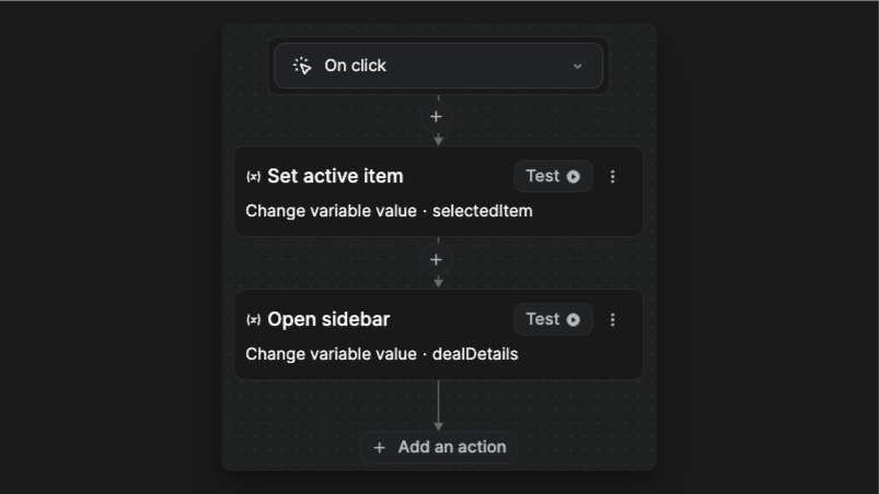
When the user clicks on a card 2 things are happening: the card becomes active and the drawer opens with the deal’s information.
This is made possible with the selectedItem object variable. On click on the card, all the deal’s information is copied inside of the selectedItem variable.
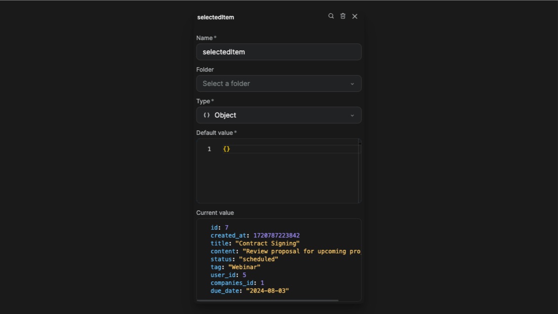
- The drawer opens with all the data of the current deal.
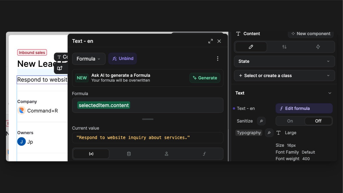
Inside of the drawer, all the elements content are bound to the selectedItem object keys.
- The clicked card becomes active.
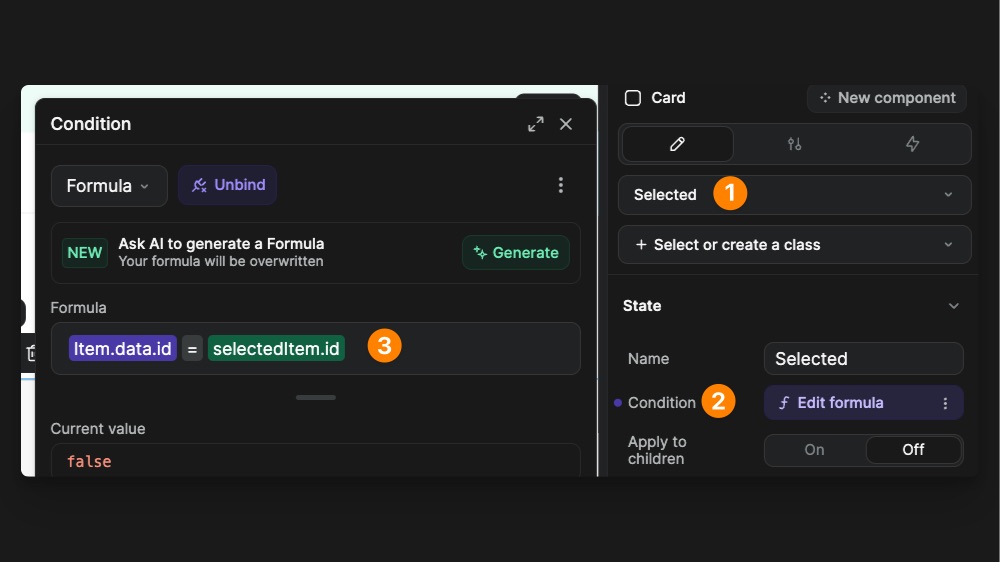
The card has a Selected state (1) that is activated when the Condition (2) is met. In this case, we are looking at the current card id, and checking if the id in the selectedItem matches it. If they are equal, the condition returns true. Inside of the state, you can modify any property that you want. On our card, we modified the background-color to be darker.
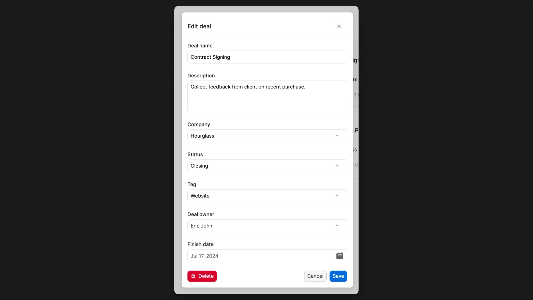
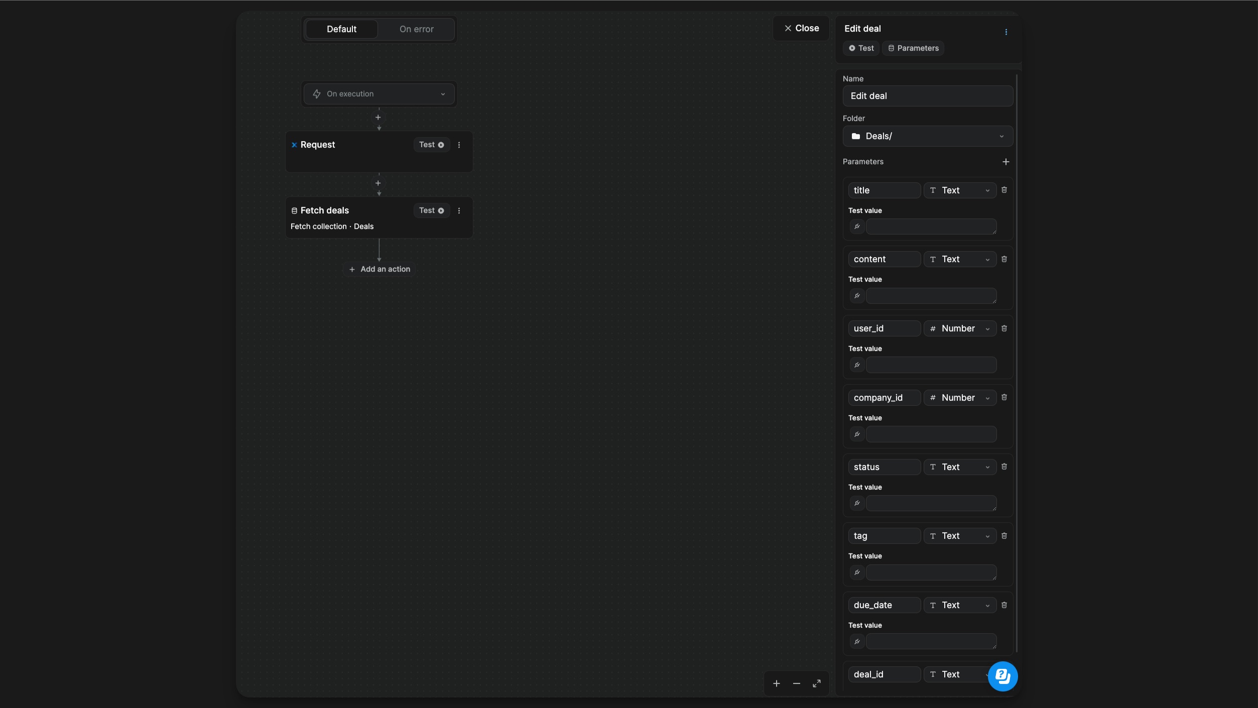
Modify a deal
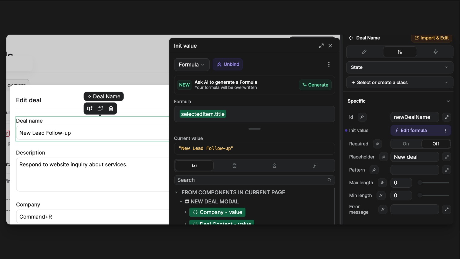
Same as the new deal workflow, you can also edit deals. When you click on Edit button in the drawer, you open the edit modal. With the Init value prop of the Input components, you can pre-fill the input with the current deal information (stored in the selectedItem variable).
Action bar
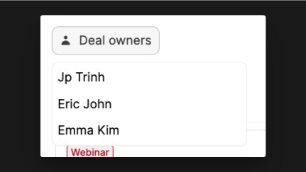
The Kanban can be filtered by deal owner. To do that, we used a Dropdown Component that acts as a Select component. When you open the dropdown, you have a collection list of all the user from the User collection.
On click on a user, the variable dealOwner is set with the user’s id. The second action is a component action linked to the dropdown. It allows us to close it after selection.
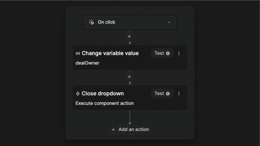
The dealOwner variable is then use in the Filter setting of the items bound to the Kanban.
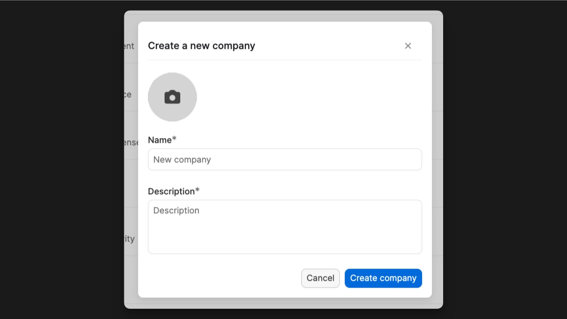
Companies page
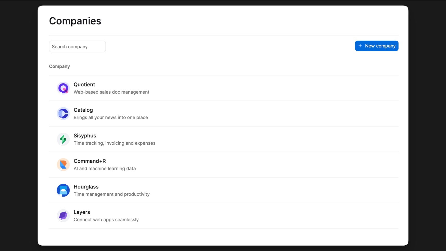
The Companies list is bound to the Companies collection. Each company has a name, a logo and a description.
On that page, we are using 3 workflows to interact with the collection:
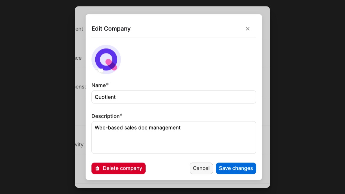
- Create company on the Form submit workflow of the New company modal.
- Edit company on the Form submit workflow of the Edit company modal.
- Delete company on the Delete button of the Edit company modal.
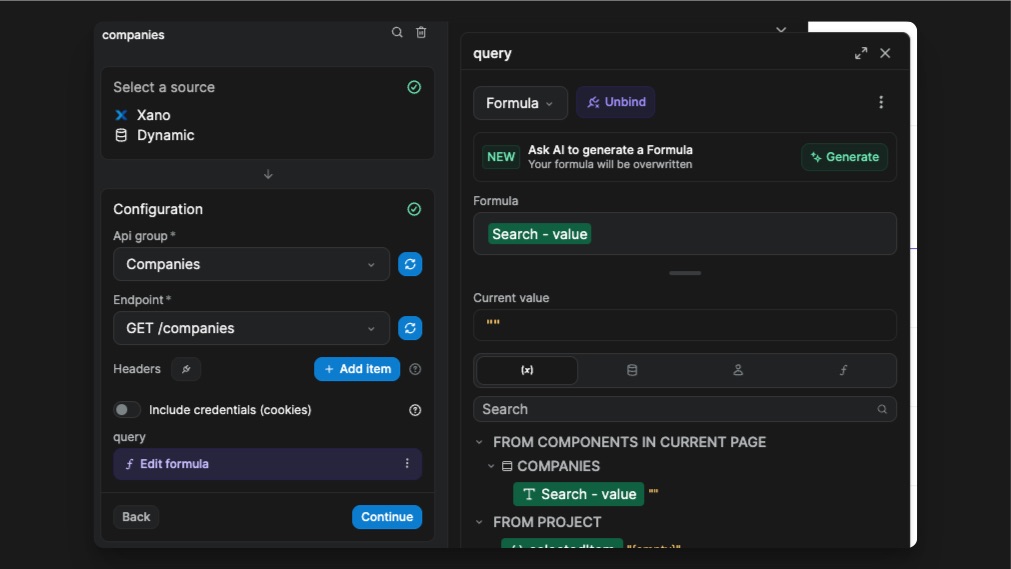
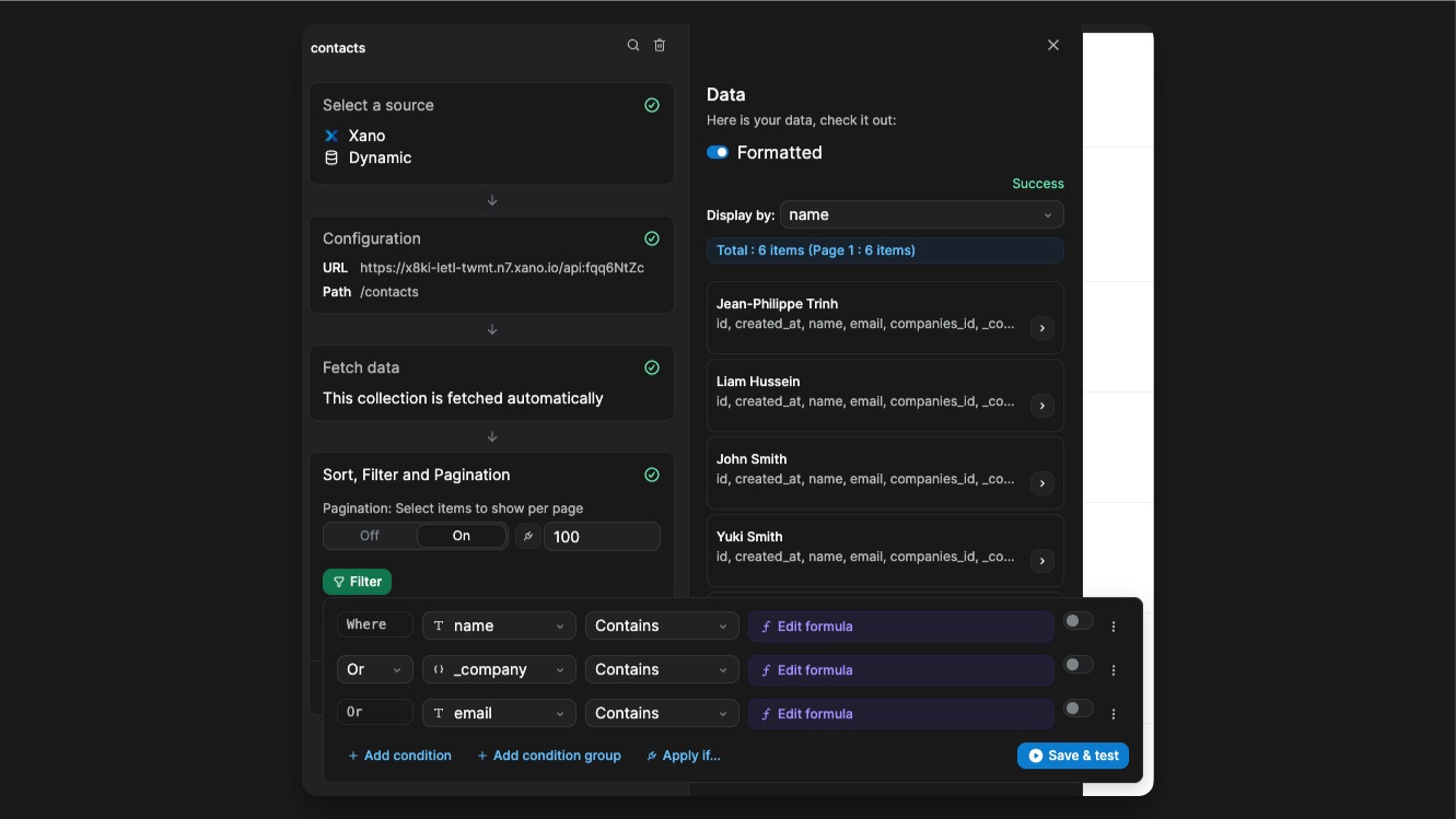
You have a search input below the Heading that allows you to perform a backend filter. The filter is set directly on the Xano endpoint. The input trigger the workflow on change. That means the collection refetched every time the input value changes, with the new query parameter.
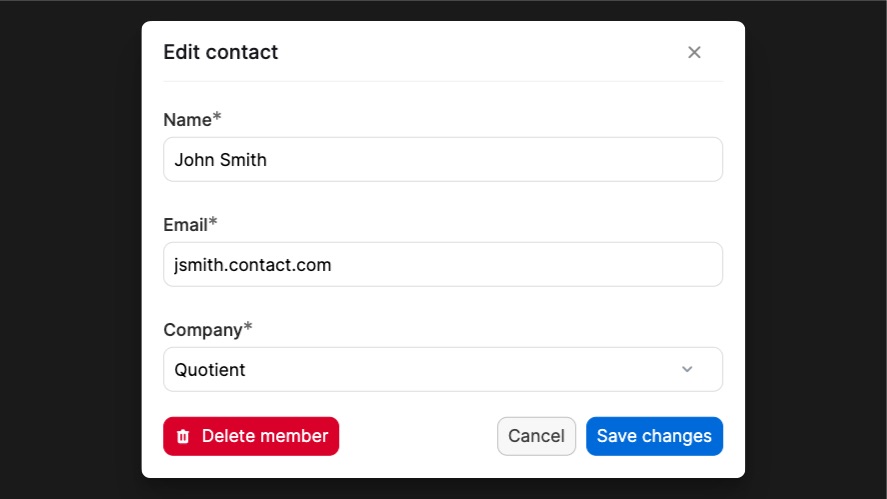
Contacts page
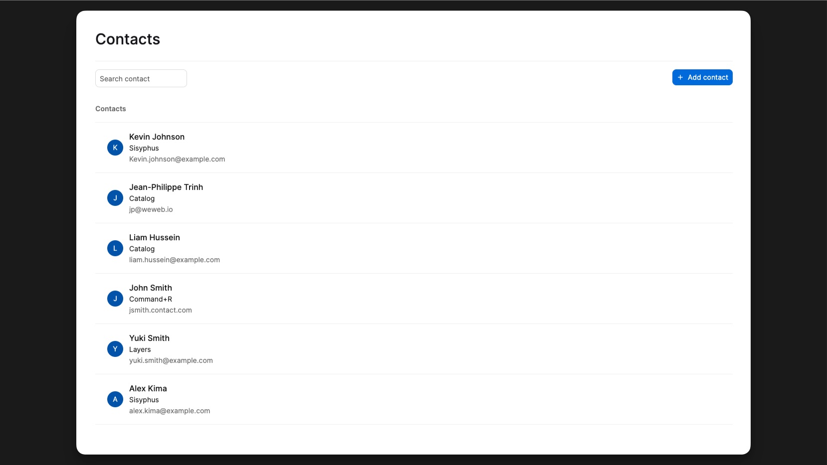
The contact list is bound to the Contacts collection. A contact has a name, a company and an email.
On that page, we are using 2 workflows to interact with the collection:
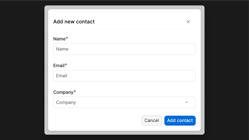
- Create contact on the Form submit workflow of the modal after clicking on Add contact.
- Edit contact on the Form submit workflow of the modal after clicking on a contact.
- Delete contact on the Delete contact button of the Edit modal
You also have the ability search for a contact with the Search input that applies a frontend filter on the list. This means, all results are still loaded in the browser but not on the page. This time, the filter was made on the Collection parameters.
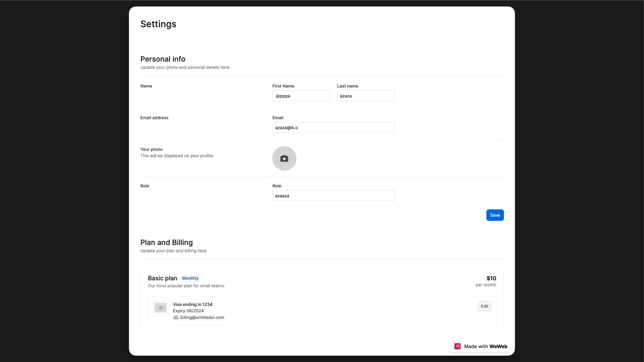
Settings page
Build your own CRM!
This template get you started building your customized CRM using WeWeb as the frontend and the backend of your choice!