Appearance
Styling Properties
Styling properties are all the options you can use to change an element's design inside your WeWeb app.
They're available on the right sidebar, under the styling tab.
TIP
All available styling properties are standard CSS properties, the WeWeb editor simply gives you a visual way to edit them.
Learn more about CSS in the WeWeb editor
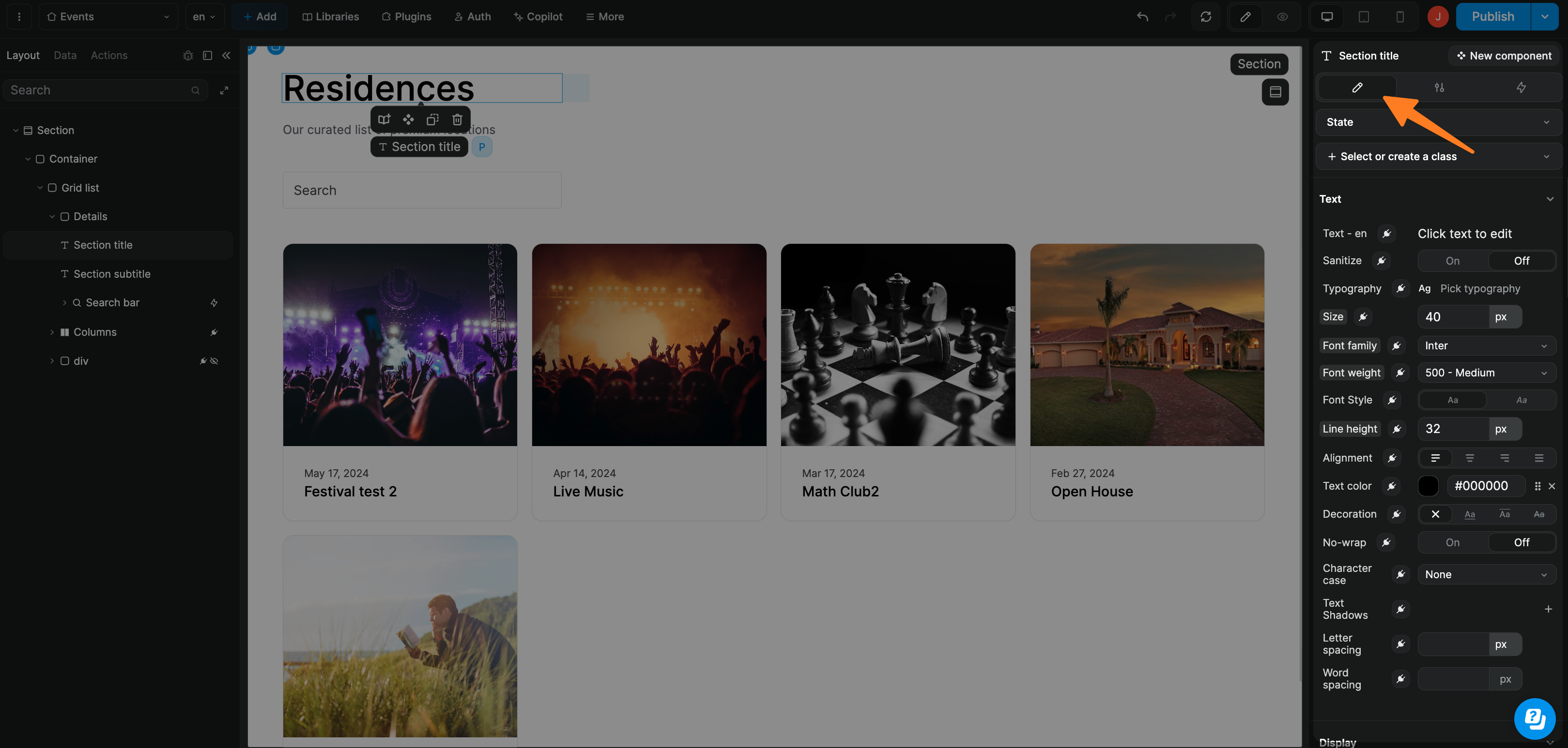
Text
Text - {lang}
Set the text that will be displayed for {language}.
You'll have to bind it for every language that's currently activated on this page.
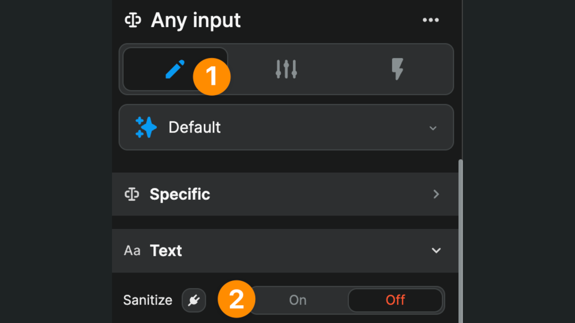
Sanitize
Escape special characters in user-generated text to prevent security issues.
This will escape special characters, so that you are not vulnerable to XSS attacks.
The option is not active by default because sometimes you want these characters to be interpreted (for example making some part of the text bold with markup).
Typography
Apply a preset text style from your library.
Size
Set the size of the text. Equivalent to CSS' font-size.
Using REM and EM Units
To use relative units like rem or em, you need to bind the Size property and manually type the size value. For example: '1.5rem', '2em', or '0.875rem'.
Understanding relative units:
rem- Relative to the root element's font size (html element)em- Relative to the parent element's font size
Customizing the root font size:
To change the base size that rem units are calculated from, you need to add custom code at the head level of your page or entire app to change the root font size using CSS, like so:
html
<style>
:root {
  font-size: 16px;
}
</style>
Font family
Choose the font used for this text. Equivalent to CSS' font-family.
Font weight
Set how bold or light the text appears. Equivalent to CSS' font-weight.
Font style
Choose between regular or italic style. Equivalent to CSS' font-style.
Line height
Adjust the space between lines of text. Equivalent to CSS' line-height.
Alignment
Align the text left, center, right, or justified. Equivalent to CSS' text-align.
Text color
Set the color of the text. Equivalent to CSS' color.
Text decoration
Add effects like underline or line-through to your text. Equivalent to CSS' text-decoration.
No-wrap
Keep the text on a single line without breaking. Equivalent to CSS' white-space.
Character case
Transform text to uppercase, lowercase, or capitalized. Equivalent to CSS' text-transform.
Text shadows
Add a shadow effect to your text. Equivalent to CSS' text-shadow.
Letter spacing
Set the space between each letter. Equivalent to CSS' letter-spacing.
Word spacing
Set the space between each word. Equivalent to CSS' word-spacing.
Display
Display
Choose if and how the element is displayed. Equivalent to CSS' display.
TIP
This is how you can hide an element on responsive mode or when a condition is met.
Align self
Override the parent container's alignment and choose how this element aligns itself. Equivalent to CSS' align-self.
Sizing
Set how this element should size itself inside the container. Equivalent to CSS' flex.
Layout
Direction
Set if items are arranged horizontally or vertically. Equivalent to CSS' flex-direction.
Rows gap
Set the space between each row of items. Equivalent to CSS' grid-row-gap.
Column gap
Set the space between each column of items. Equivalent to CSS' grid-column-gap.
Justify
Set how items are spaced horizontally. Equivalent to CSS' justify-content.
Alignment
To set how the items should be aligned vertically (for example: top, center, bottom, etc). Equivalent to CSS' align-items.
Reverse
Display items in the opposite order. Equivalent to CSS' flex-direction.
Last to the end
Move the last item to the end of the container.
Sizing
Width
Set the width of the element. Equivalent to CSS' width.
Height
Set the height of the element. Equivalent to CSS' height.
Max-width
Set the maximum width of the element. Equivalent to CSS' max-width.
Min-width
Set the minimum width of the element. Equivalent to CSS' min-width.
Max-height
Set the maximum height of the element. Equivalent to CSS' max-height.
Min-height
Set the minimum height of the element. Equivalent to CSS' min-height.
Spacing
Padding
Set the inner spacing of the element. Equivalent to CSS' padding.
Margin
Set the outer spacing around the element. Equivalent to CSS' margin.
Background
Color
To set the background color of the element. Equivalent to CSS' background-color.
Image
To set the background image of the element. Equivalent to CSS' background.
Borders & Shadows
Borders
Set the borders of the element. Equivalent to CSS' border.
Outline
Add a visible outline around the element. Equivalent to CSS' outline.
Offset
Set the distance between the element's outline and its edge. Equivalent to CSS' outline-offset.
Radius
Make the element's corners rounded. Equivalent to CSS' border-radius.
Shadows
Set the shadows of the element. Equivalent to CSS' box-shadow.
Effects
Opacity
Set how transparent the element is. Equivalent to CSS' opacity.
Position
Set how the element is positioned on the page. Equivalent to CSS' position.
Z axis
Set which elements appear in front or behind others. Equivalent to CSS' z-index.
Cursor
Set the mouse cursor shown when hovering over the element. Equivalent to CSS' cursor.
Overflow
Set what happens when content goes outside the element. Equivalent to CSS' overflow.
Transform
Apply effects like move, rotate, or scale to the element. Equivalent to CSS' transform.
Transition
Smoothly animate changes like hover effects or size updates. Equivalent to CSS' transition.
Perspective
Add 3D depth effects to the element. Equivalent to CSS' perspective.
Animation
The animations section allows you to configure how the element should animate itself.
Check out the dedicated animations documentation to learn more ->
Custom CSS
Add your own custom styles if needed. Equivalent to CSS' style.