Appearance
Advanced properties
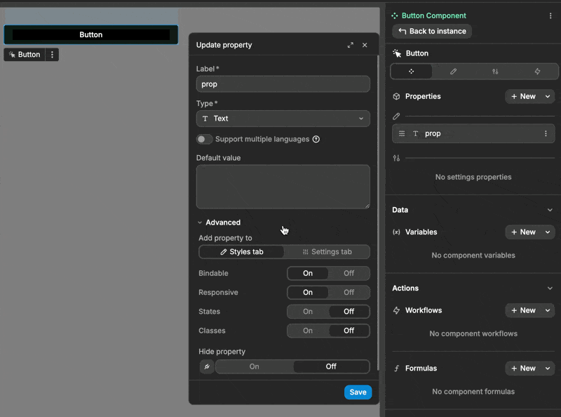
When creating a component property, beyond just setting its label and type, you can configure advanced settings by expanding the Advanced section:
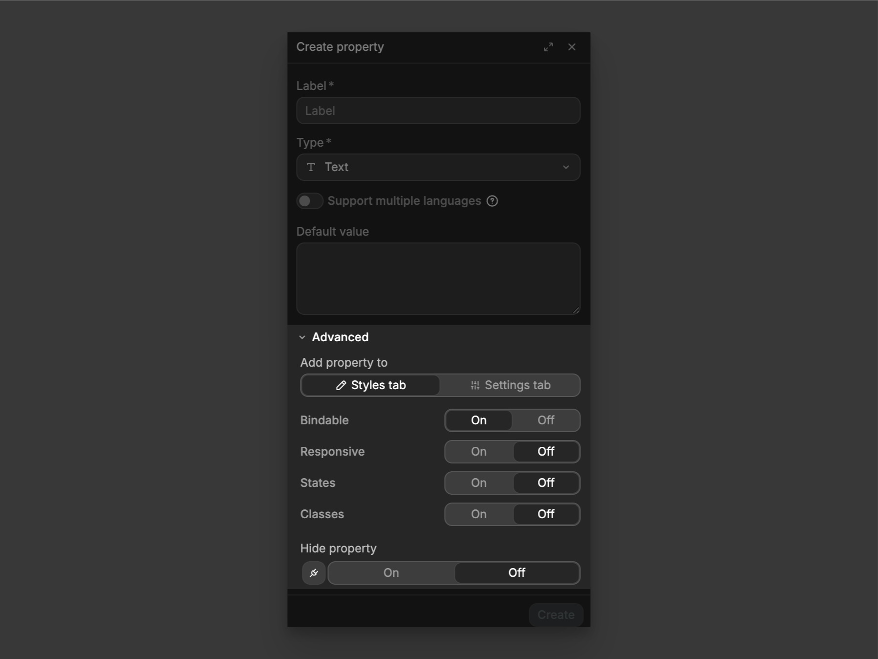
The Advanced settings in component properties give you different ways to control how you want your properties to behave. Each setting determines:
- Where you'll find the property (
StylesorSettingstab) - What values you can use (fixed only, or both fixed and dynamic with
Bindable) - If it can change with screen size (
Responsive) - If it can change with states like hover (
States) - If you can save values as reusable classes (
Classes) - If the property is visible or hidden (
Hide property)
These toggles let you configure exactly how your properties will work in your component.
Bindable
On: property can accept both fixed values and dynamic values
Off: property can only accept fixed values
Responsive
On: Different values per screen sizeOff: Same value across all devices
States
On: Define values for different states (hover, active, etc.)Off: Single state only
Classes
As your project grows and you reuse components across different places, setting up each component's properties one by one can become time-consuming.
Classes let you:
- Configure property values once
- Save them as a reusable class in your WeWeb library
- Apply that class to any instance of the component
Think of Classes as presets for your component properties - set up once, reuse everywhere. This not only saves time but also ensures consistency across your project.
A practical use case
Imagine you have an input component that can be reused as a username field, email field, or password field.
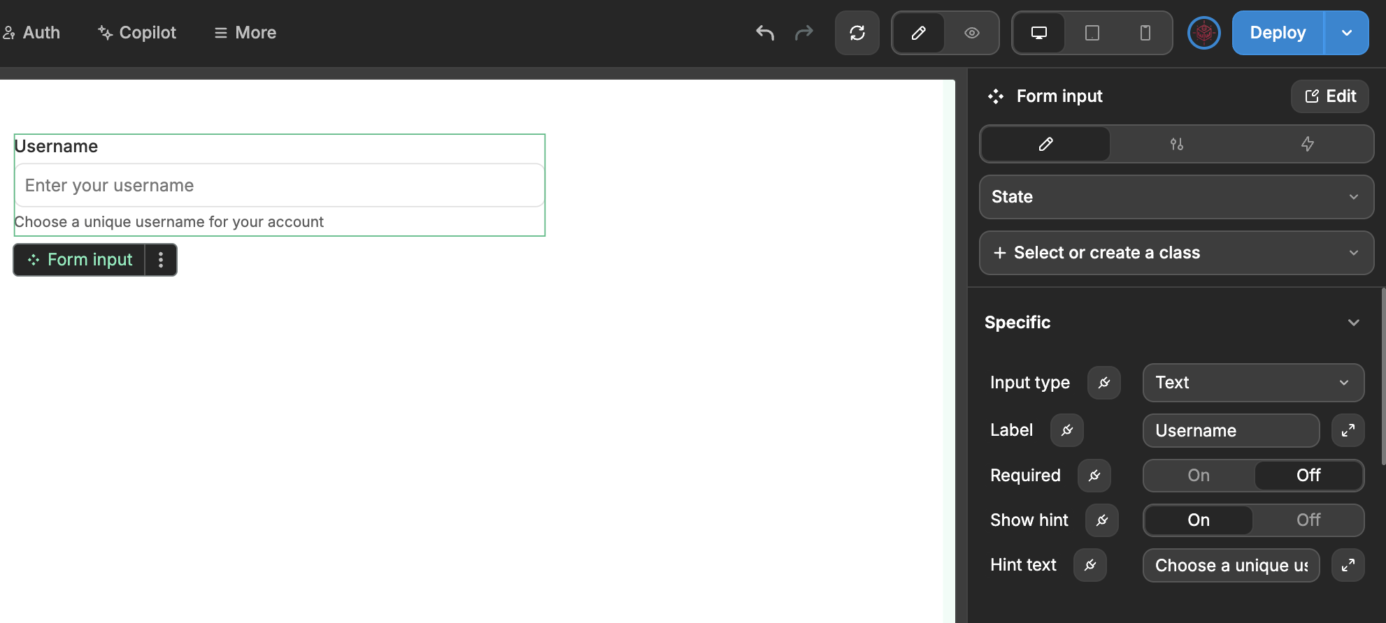
When you add another instance of this input to use as a username field, you need to reconfigure all its properties again:
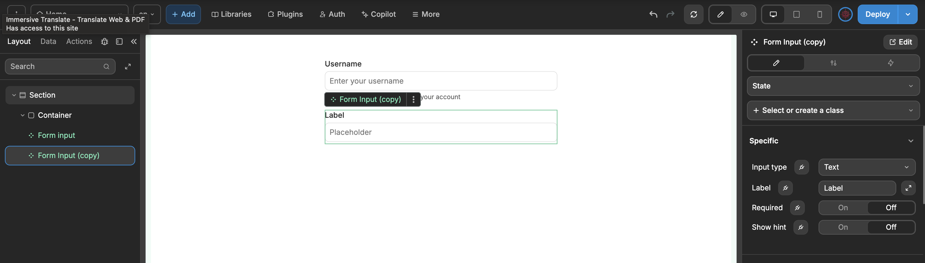
Instead of manually setting these same properties (label, value, hint text) every time you need a username field in your app, you can:
- Toggle the
Classesoption for each property
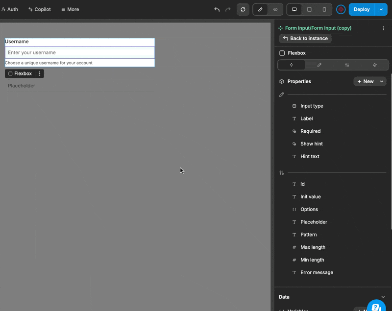
- Exit the component's Edit mode and save all these username-specific instance properties as a reusable class in your library.
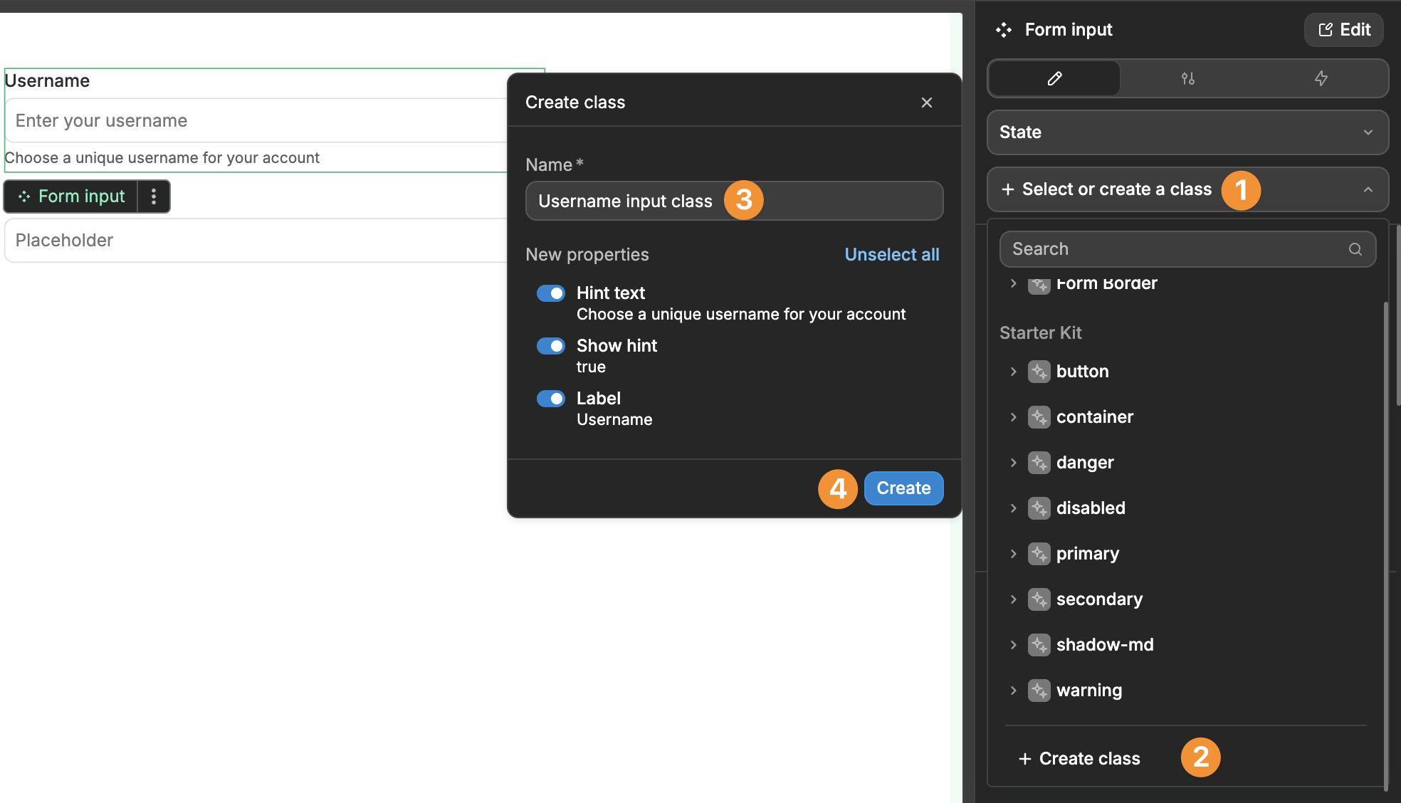
Next time you need a username input, just add the component and select this class
This way, one click applies all the username field settings instead of configuring each property manually. It's especially useful when you're using the same input configuration repeatedly throughout your project.