Appearance
Date Picker
The Date Picker provides a versatile interface for selecting dates, times, or both. It supports single date selection, date ranges, and multiple date selection with extensive customization options including custom formats, timezones, flow-based selection, and comprehensive styling controls.
Features
- Multiple selection modes: single date, date range, or multiple dates
- Flexible time modes: datetime, date-only, time-only, month, or year selection
- Custom formatting: predefined formats or custom display patterns
- Timezone support: locale-based or specific timezone handling
- Flow-based selection: customizable step-by-step selection process
- Range constraints: minimum/maximum range limits and auto-range options
- Advanced date restrictions: allowed dates, disabled dates, and disabled weekdays
- Multi-calendar views: side-by-side calendars for range selection
- Extensive styling: comprehensive theme customization options
Getting Started
Using AI
The quickest way to set up a date picker is by using AI:
- Ask AI to add a date picker. Specify:
- The selection mode you need (single, range, or multiple dates)
- The time mode (date-only, datetime, time-only, etc.)
- Any specific formatting requirements
- Styling preferences
Example prompts:
- "Add a date picker for selecting a single date with MM/DD/YYYY format"
- "Create a date range picker for booking dates with a 7-day maximum range"
- "Add a time-only picker with 24-hour format and seconds"
The AI will create your configured date picker with appropriate styling
Continue refining by asking for specific modifications:
- "Change the date format to show full month names"
- "Add timezone selection for UTC"
- "Disable weekends from selection"
Manual Setup
- Add the Date Picker element from the
Addpanel - Configure the selection mode:
- Set
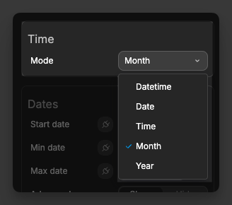
Modeto Single, Range, or Multi dates - Choose the time mode (Datetime, Date, Time, Month, or Year)
- Set
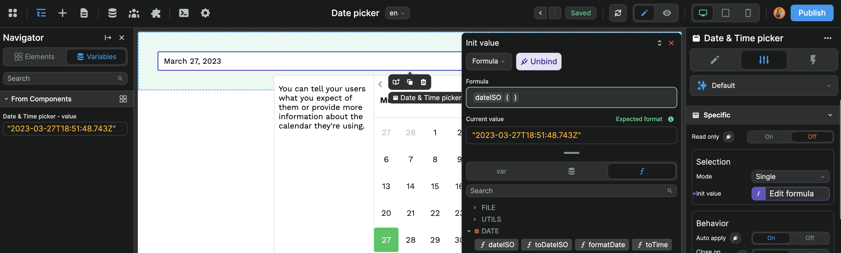
- Set initial values if needed:
- For single mode: set
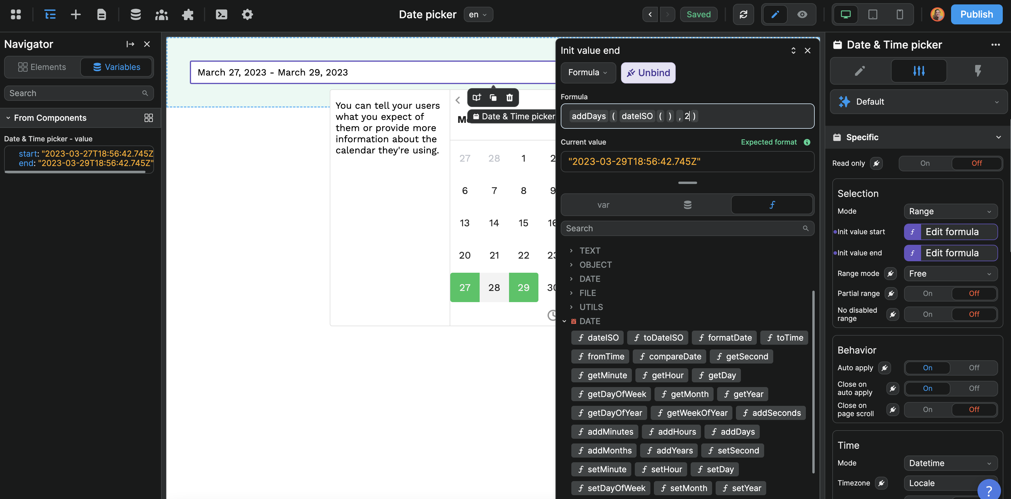
Init value - For range mode: set
Init value startandInit value end - For multi-date mode: provide an array of dates
- For single mode: set
- Configure display options:
- Choose a
Formator create a custom format - Set language and locale preferences
- Choose a
- Apply styling through the comprehensive theme options
Selection Modes
The date picker supports three main selection modes, each with different use cases and behaviors.
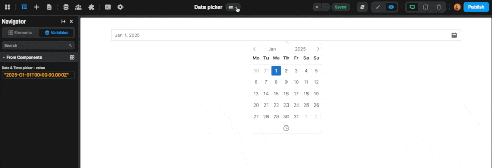
Single Mode
Perfect for selecting one specific date or time:
- Set
ModetoSingle - Optionally set an
Init valueusing a formula likenew Date()for today - The component variable will contain a single date string
Range Mode
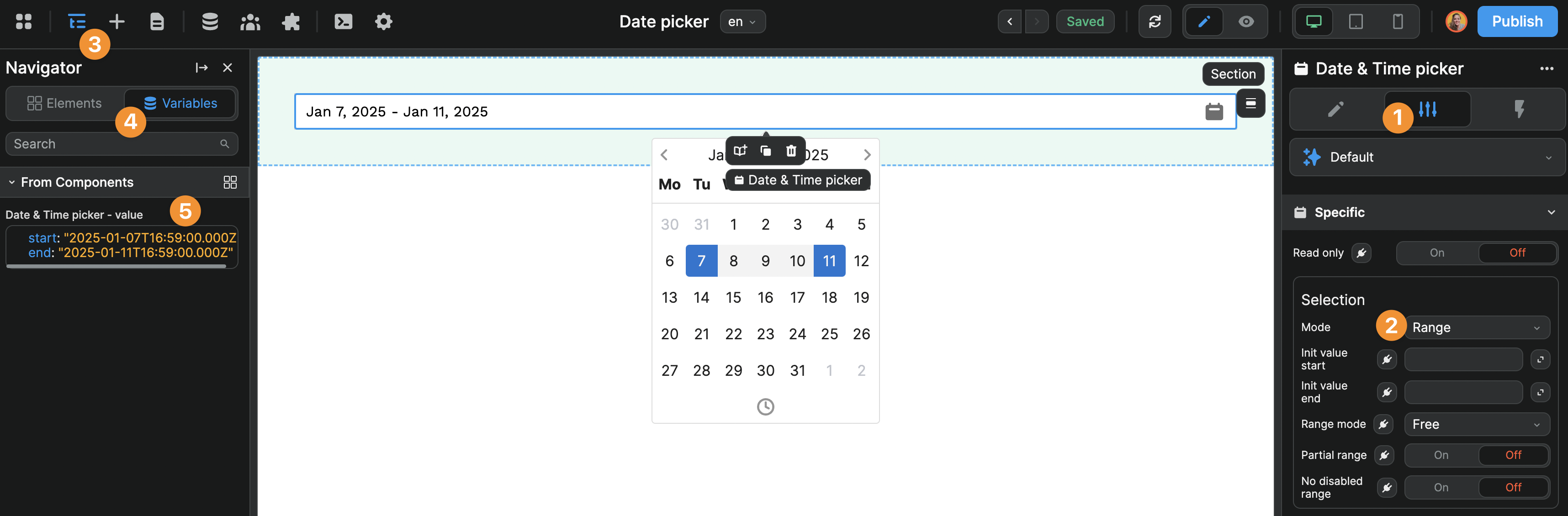
Ideal for booking systems, date intervals, and period selection:
- Set
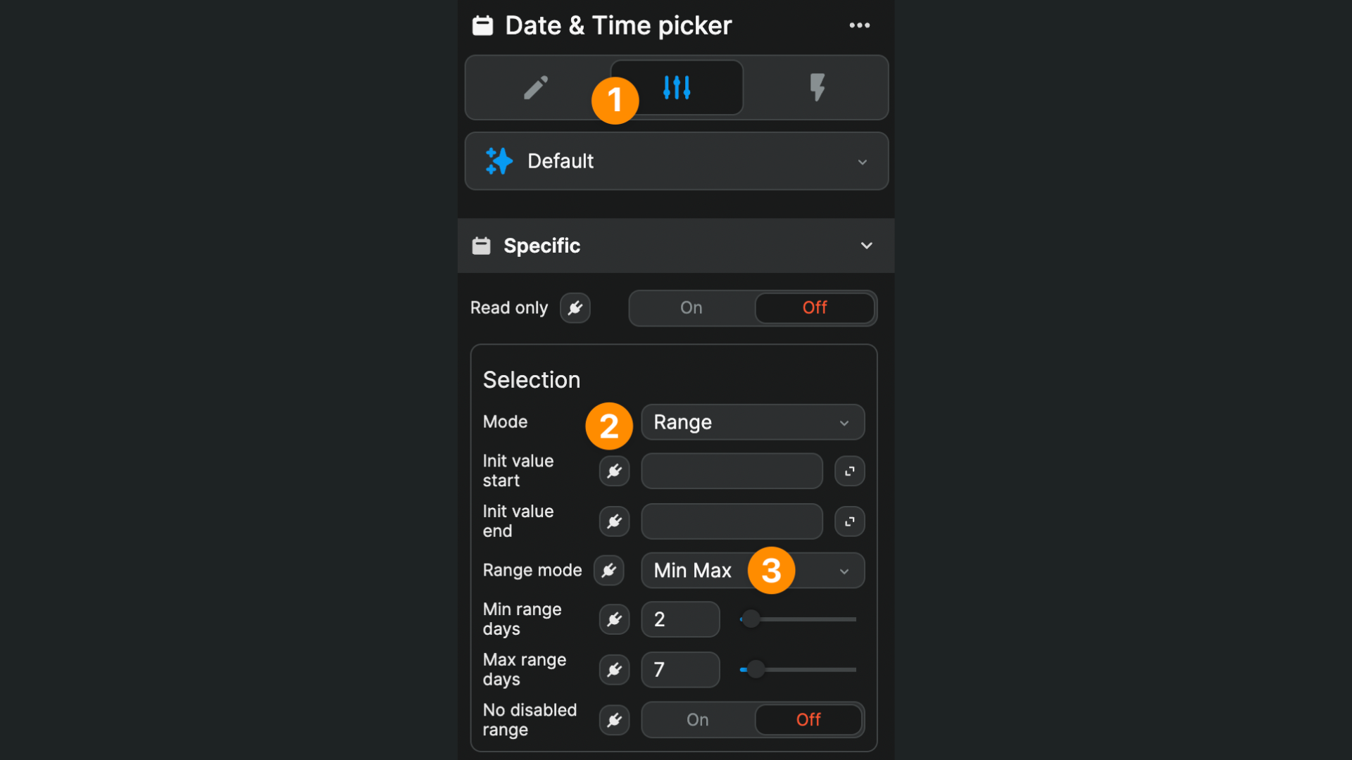
ModetoRange - Configure range behavior:
- Free: users can select any date range
- Auto: users select start date, range ends after specified days
- Min Max: enforce minimum and maximum range lengths
Example Min Max configuration for 2-7 night bookings:
The component variable will contain an object with start and end properties:
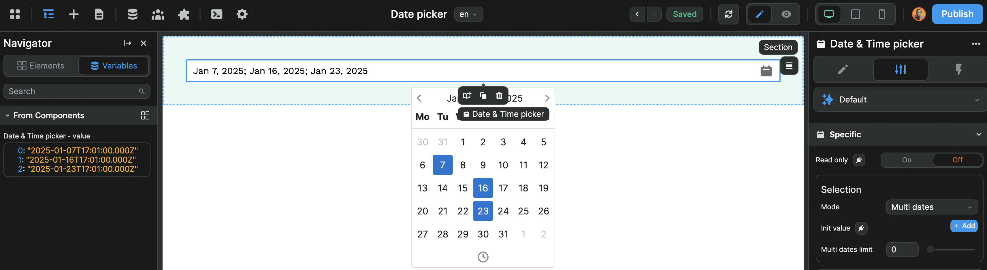
Multi Dates Mode
Useful for selecting multiple individual dates:
- Set
ModetoMulti dates - Optionally set
Multi dates limitto restrict the number of selections - Provide an array of initial dates if needed
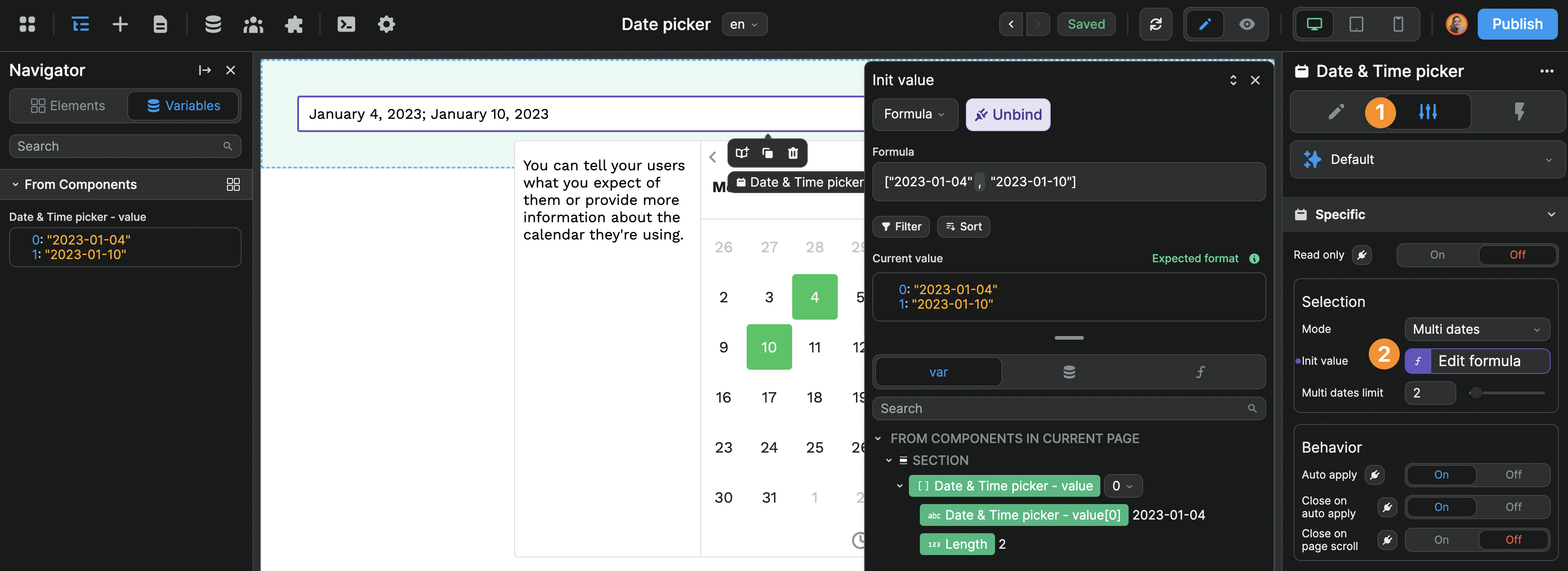
The component variable will be an array of date strings:
Time Modes
Control what type of date/time information users can select:
| Mode | Variable Format | Use Case |
|---|---|---|
| Datetime | "2025-01-06T23:00:00.000Z" | Full date and time selection |
| Date | "2025-01-10" | Date-only selection |
| Time | "19:28:00" | Time-only selection |
| Month | "2025-01" | Month and year selection |
| Year | "2025" | Year-only selection |
Time-Specific Settings
For Datetime and Time modes:
- 24h mode: Toggle between 12-hour and 24-hour time format
- Enable seconds: Include seconds in time selection
- Timezone: Choose locale-based or specific timezone handling
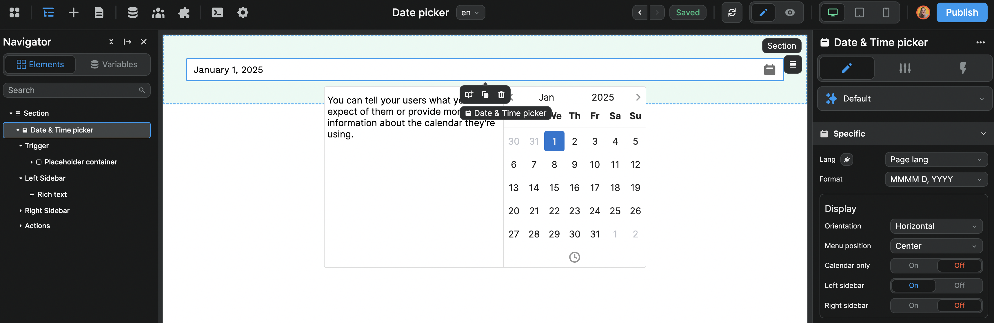
Display and Formatting
Language Support
Set the calendar language:
- Select
Page langto use the current page language - Choose a specific language from available options
Date Format Options
Control how dates are displayed to users:
| Format | Example Output |
|---|---|
| DD/MM/YYYY | 05/01/2025 |
| MMMM D, YYYY | January 5, 2025 |
| MMM D, YYYY | Jan 5, 2025 |
| h:mm A | 2:30 PM |
| Custom | Your custom format |
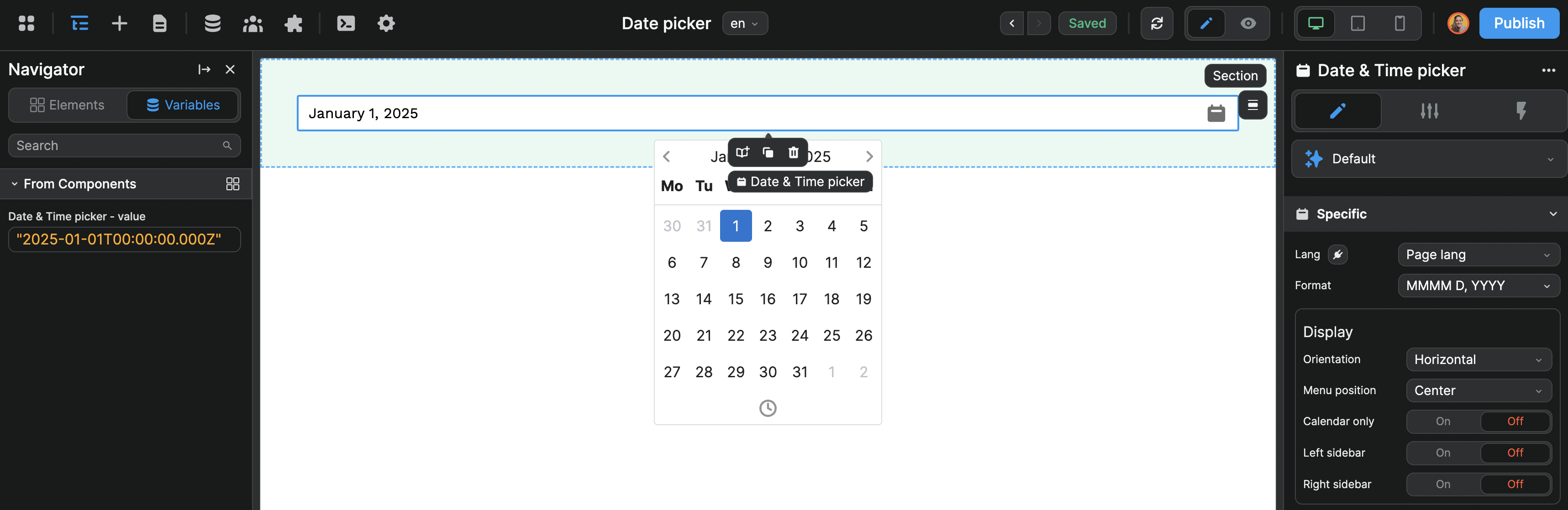
The component variable value remains unchanged regardless of display format.
Display Options
- Menu position: Center, Left, or Right alignment
- Calendar only: Show calendar without trigger button
- Orientation: Horizontal or Vertical layout
- Left/Right sidebars: Add custom content areas
Advanced Configuration
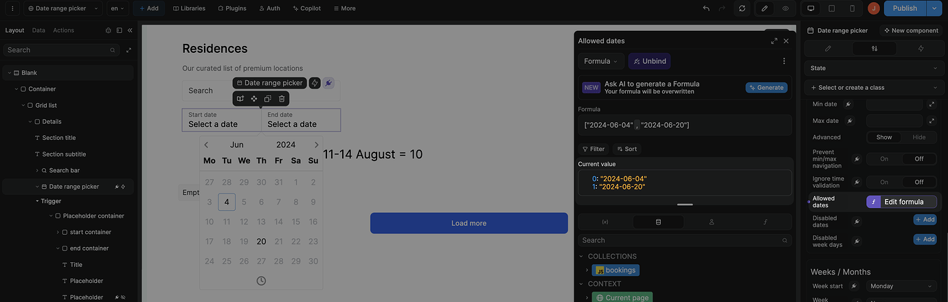
Date Restrictions
Control which dates users can select:
- Min date: Earliest selectable date
- Max date: Latest selectable date
- Start date: Initial calendar view date
- Allowed dates: Whitelist specific dates only
- Disabled dates: Blacklist specific dates
- Disabled week days: Disable specific weekdays (0=Sunday, 1=Monday, etc.)
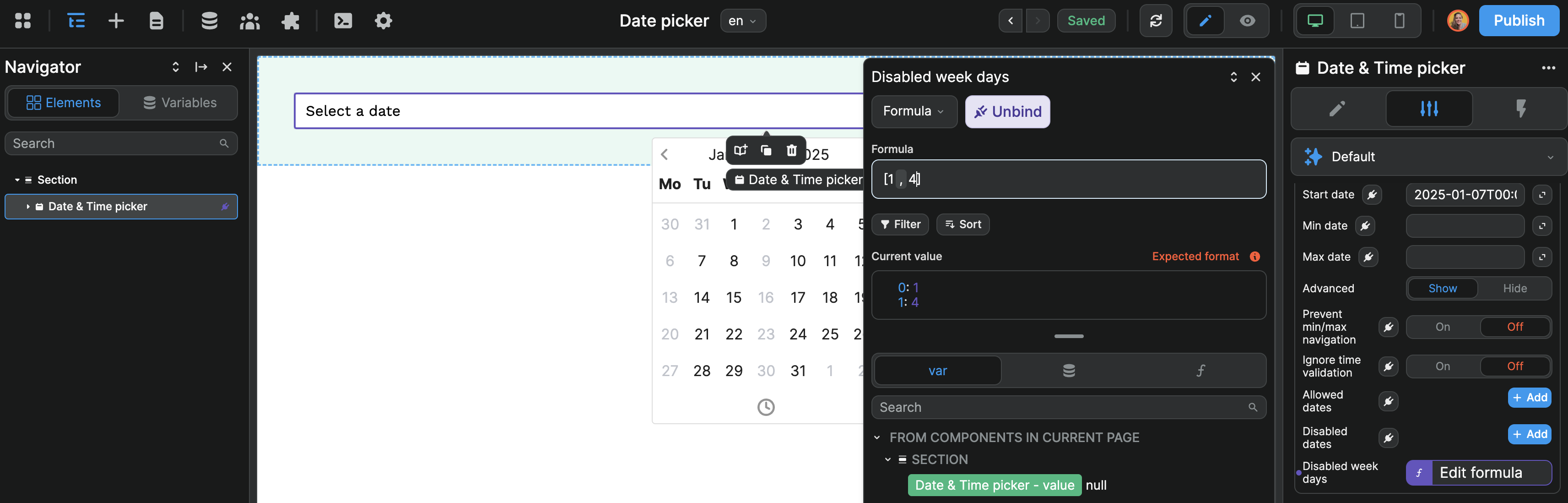
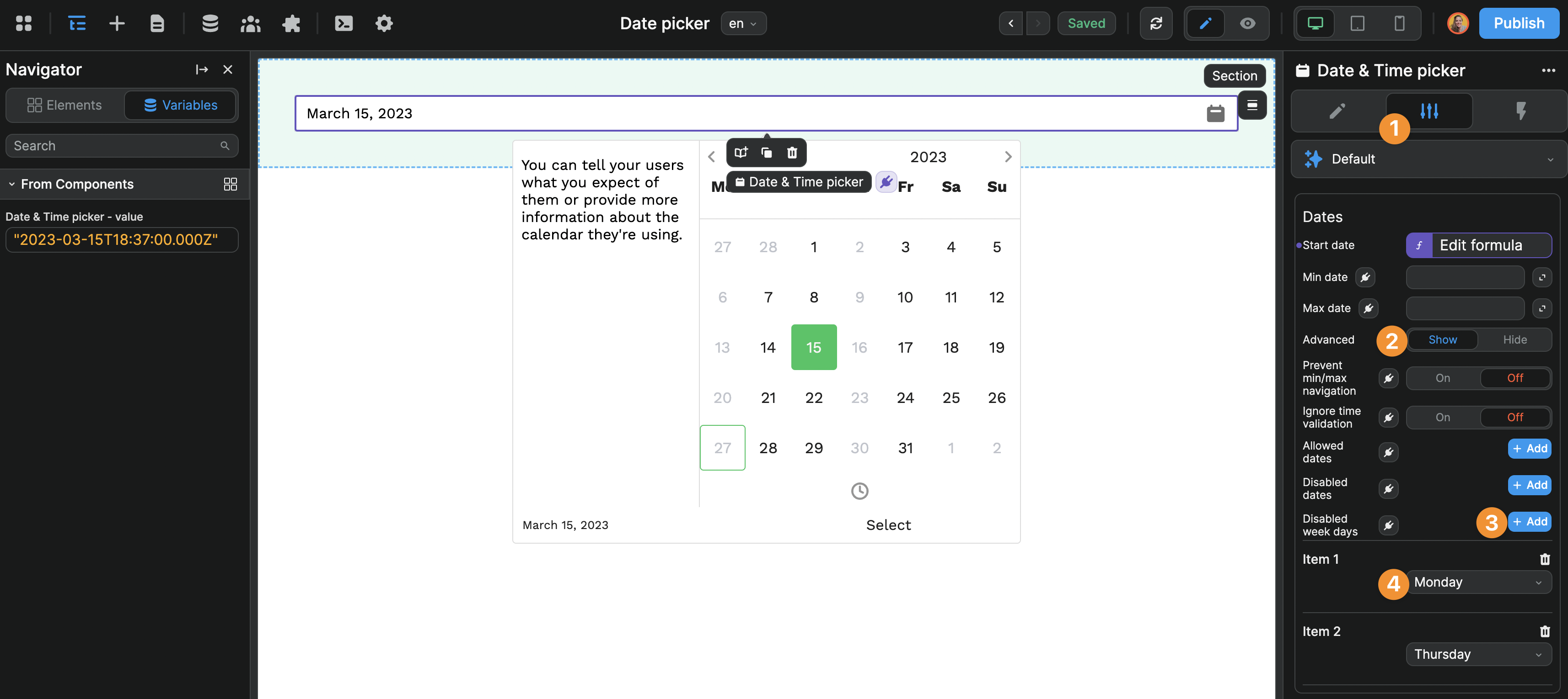
Date Arrays
The Allowed dates, Disabled dates, and Disabled week days settings expect arrays. Even for single dates, wrap in an array: ["2024-06-04"]
Behavior Settings
- Auto apply: Automatically confirm selection without requiring a confirm button
- Close on auto apply: Close the calendar after auto-applying selection
- Prevent min/max navigation: Restrict calendar navigation beyond min/max dates
Week and Month Settings
- Week start: Choose which day starts the week (Sunday through Saturday)
- Week numbers: Display ISO or local week numbers
- Hide offset dates: Hide days from adjacent months
- Disable month/year select: Remove month/year navigation controls
Flows
The Flow is the order in which users will be invited to pick a date and/or time.
By default, when the user clicks on a date picker element, they see a monthly calendar which they can navigate in. Depending on your use case, this can be a bit cumbersome.
To change this UX, you can enable the Flow setting and fully control how the user will interact with the date picker.
In the example below, we configured the date picker flow so the user would be invited to choose a year and month before selecting the correct day in the calendar:
Handling Closing Manually (For flow-based selection)
When using flow-based selection, you may need to handle the closing of the Date Picker manually depending on your flow steps and whether you have Close on auto apply disabled.
To do so:
- Enable Flow: Turn on the
Flowsetting to enable step-by-step selection - Create a workflow: Add a workflow using the
On flow steptrigger - Monitor the flow step: Check when the flow reaches your desired completion step number
- Close the picker: Use the
Close Menucomponent action to close the date picker
Example workflow setup:
- If your flow has 3 steps (Month → Day → Hour), you would trigger the
Close Menuaction whenOn flow stepreports step number 3
Flow-Based Selection Modes
When using flow-based selection, it's crucial that your selected Mode aligns with the steps defined in your Flow configuration.
Mode and Flow Alignment
The Mode you select must match the flow steps you configure. Misalignment will cause the flow to behave unexpectedly or break entirely.
Critical alignment examples:
- Date Mode: Should use flows like
['month', 'calendar']or['calendar'] - Time Mode: Should use flows like
['time']or['hours', 'minutes'] - Datetime Mode: Should use flows like
['month', 'calendar', 'time']or['calendar', 'hours', 'minutes'] - Month Mode: Should use flows like
['month']or['year', 'month'] - Year Mode: Should use flows like
['year']
Common mistakes to avoid:
- Using
Timemode with['month', 'calendar']flow - this will break since time mode doesn't have month/calendar steps - Using
Datemode with['time']flow - this will fail since date mode doesn't include time selection
Multi-Calendar Views
For range selection, display multiple calendars side-by-side:
- Enable
Multi calendars(available for range mode) - Set the number of calendars to display (2-4)
- Choose between linked or independent calendar navigation
Example Use Cases
Event Date Selection
- Set mode to
SinglewithDatetime mode - Use format
MMMM D, YYYYfor clear display - Set minimum date to today to prevent past dates
Booking System
- Configure
Rangemode withMin Maxrange type - Set minimum 1 night, maximum 14 nights
- Disable unavailable dates using
Disabled dates - Enable multi-calendar view for better UX
Appointment Scheduling
- Use
Datetimemode withSingleselection - Enable
24h modeandEnable secondsif needed - Set specific timezone for consistent scheduling
- Use
Allowed datesto only show available appointment slots
Time Tracking
- Set to
Timemode for duration selection - Enable
24h modeandEnable seconds - Use range mode for start/end time selection
Best Practices
Do:
- Use appropriate time modes for your use case (don't include time for date-only selections)
- Set reasonable date restrictions to guide users
- Choose formats that match user expectations in your region
- Use flow-based selection for dates far from today
Don't:
- Forget to handle timezone differences for global applications
- Set conflicting date restrictions (min date after max date)
Forking
While the Date Picker offers extensive built-in customization, you may need additional functionality beyond what's available. You can fork the element to add custom features.
If you are unsure how to fork an element, learn more in the dedicated documentation.
Properties Reference
Settings
| Property | Options/Type | Description |
|---|---|---|
Read only | boolean | Prevents user interaction with the date picker |
Required | boolean | Makes the date picker required for form validation |
Selection Settings
| Property | Options/Type | Description |
|---|---|---|
Mode | Single Range Multi dates | Selection mode for the date picker |
Init value | text | Initial value for single mode (ISO date string) |
Init value start | text | Initial start value for range mode |
Init value end | text | Initial end value for range mode |
Init value | array | Initial values for multi-date mode |
Multi dates limit | number | Maximum number of dates selectable in multi mode |
Range mode | Free Auto Min Max | Range selection behavior |
Partial range | boolean | Allow partial range selection |
Auto range days | number | Number of days for auto range mode |
Min range days | number | Minimum days required for range |
Max range days | number | Maximum days allowed for range |
Time Settings
| Property | Options/Type | Description |
|---|---|---|
Mode | Datetime Date Time Month Year | Type of date/time selection |
Timezone | select | Timezone for datetime handling |
24h mode | boolean | Use 24-hour time format |
Enable seconds | boolean | Include seconds in time selection |
Date Restrictions
| Property | Options/Type | Description |
|---|---|---|
Start date | text | Initial date shown in calendar |
Min date | text | Earliest selectable date |
Max date | text | Latest selectable date |
Prevent min/max navigation | boolean | Restrict navigation beyond min/max dates |
Allowed dates | array | Whitelist of selectable dates |
Disabled dates | array | Blacklist of non-selectable dates |
Disabled week days | array | Days of week to disable (0=Sunday, 1=Monday, etc.) |
Display Settings
| Property | Options/Type | Description |
|---|---|---|
Lang | select | Language for calendar display |
Format | select | Predefined date format options |
Custom Format | text | Custom format string (when Format is "Custom") |
Menu position | Center Left Right | Calendar popup position |
Orientation | Horizontal Vertical | Calendar layout orientation |
Calendar only | boolean | Show calendar without trigger button |
Multi calendars | boolean | Enable multiple calendar views |
Calendars number | number | Number of calendars to display (2-4) |
Week and Month Settings
| Property | Options/Type | Description |
|---|---|---|
Week start | Sunday through Saturday | First day of the week |
Week numbers | None Local ISO | Week number display type |
Hide offset dates | boolean | Hide days from adjacent months |
Disable month/year select | boolean | Remove month/year navigation |
Behavior Settings
| Property | Options/Type | Description |
|---|---|---|
Auto apply | boolean | Automatically apply selection |
Close on auto apply | boolean | Close calendar after auto-apply |
Flow Settings
| Property | Options/Type | Description |
|---|---|---|
Flow | boolean | Enable step-by-step selection |
Steps | array | Order of selection steps |
Styling
The Date Picker offers extensive theming options organized into categories:
Style Properties
| Property | Description |
|---|---|
| Font family | Typeface for all text elements |
| Font size | Base font size for calendar |
| Time font size | Font size for time display |
| Preview font size | Font size for selected date preview |
| Border radius | Roundness of calendar and input borders |
| Cell border radius | Roundness of individual date cells |
| Cell size | Dimensions of date cells |
| Cell padding | Internal spacing of date cells |
| Menu min width | Minimum width of calendar popup |
Color Properties
| Property | Description |
|---|---|
| Primary Color | Main accent color for selections |
| Secondary Color | Secondary UI elements color |
| Background Color | Calendar background color |
| Text Color | Default text color |
| Primary Text Color | Text color on primary backgrounds |
| Hover Color | Background color on hover |
| Disabled Color | Color for disabled elements |
| Border Color | Default border color |
| Success Color | Color for valid selections |
| Danger Color | Color for invalid selections |
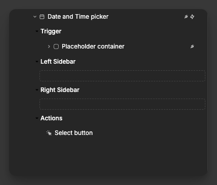
Dropzones/Default Elements
Trigger | Dropzone: whatever elements you place here will open the Date Picker on click
Left Sidebar | Dropzone: allows you to place elements in the left sidebar of the Date Picker (must have
Left sidebarproperty enabled for this dropzone to appear)Right Sidebar | Dropzone: allows you to place elements in the right sidebar of the Date Picker (must have
Right sidebarproperty enabled for this dropzone to appear)Actions | Element: Allows you to control the appearance of the
Selectbutton inside the Date Picker (button will only appear when theAuto applyproperty is disabled)
Component Actions
| Action | Description | Parameters |
|---|---|---|
| Clear | Clears the current selection | None |
| Open Menu | Opens the date picker calendar | None |
| Close Menu | Closes the date picker calendar | None |
Event Triggers
| Event | Description | Payload |
|---|---|---|
| On change | Triggered when the selection changes | { value: string | object | array } |
| On init value change | Triggered when initial value changes | { value: string | object | array } |
| On flow step | Triggered when moving between flow steps (must have Flow setting enabled) | { value: number } |
Example Event Payloads
On change (Single mode)
javascript
{
  value: "2025-01-15T10:30:00.000Z"
}
On change (Range mode)
javascript
{
  value: {
    start: "2025-01-15T00:00:00.000Z",
    end: "2025-01-20T00:00:00.000Z"
  }
}
On change (Multi-date mode)
javascript
{
  value: [
    "2025-01-15T00:00:00.000Z",
    "2025-01-18T00:00:00.000Z",
    "2025-01-22T00:00:00.000Z"
  ]
}
On flow step
javascript
{
  value: 2  // Current step number in the flow
}
Exposed Variables
The date picker exposes the following variable for use in your application:
| Variable | Type | Description |
|---|---|---|
value | string | object | array | Selected date(s) based on selection mode |
Example Variable Values
Single mode
javascript
"2025-01-15T10:30:00.000Z"Range mode
javascript
{
  "start": "2025-01-15T00:00:00.000Z",
  "end": "2025-01-20T00:00:00.000Z"
}
Multi-date mode
javascript
[
  "2025-01-15T00:00:00.000Z",
  "2025-01-18T00:00:00.000Z",
  "2025-01-22T00:00:00.000Z"
]