Appearance
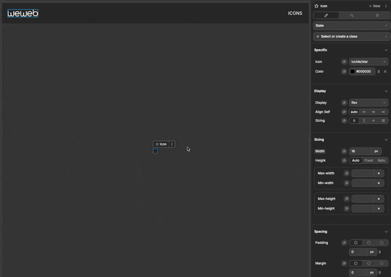
Icon
The Icon element allows you to use custom SVG icons in your projects. You can upload your own SVG files or use pre-made icon libraries to enhance your UI design.
Getting Started
- Add an Icon element to your page
- Select your desired icon from pre-made libraries or your custom uploads
- Customize the color property if needed
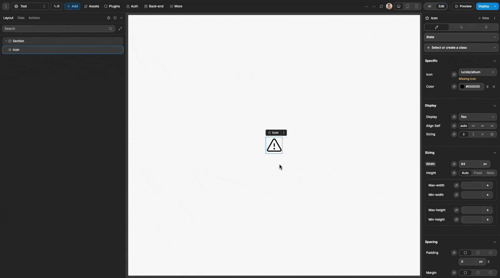
WARNING
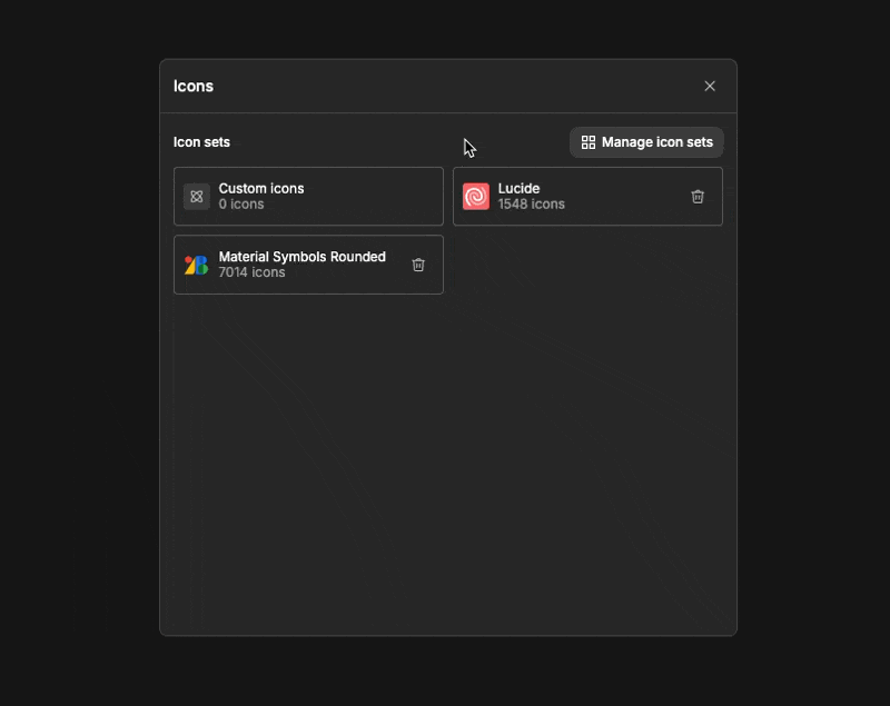
If you're working with a project that was created prior to the release of this icon element (13.03.2025) and your icon elements appear broken, you will need to manually add the Lucide library. To do so, go to Assets → Icons → Manage icon sets and add the Lucide library.
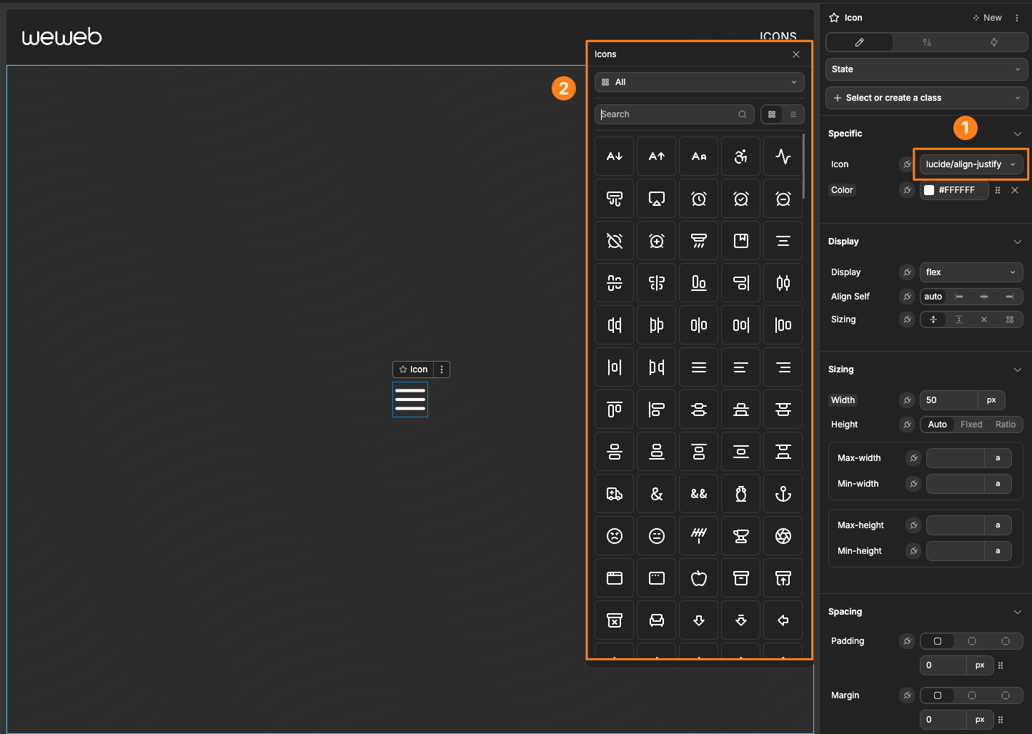
Properties
| Property | Description |
|---|---|
| Icon | Select the icon to display from available libraries or custom uploads |
| Color | Choose the color for your icon using the color picker |
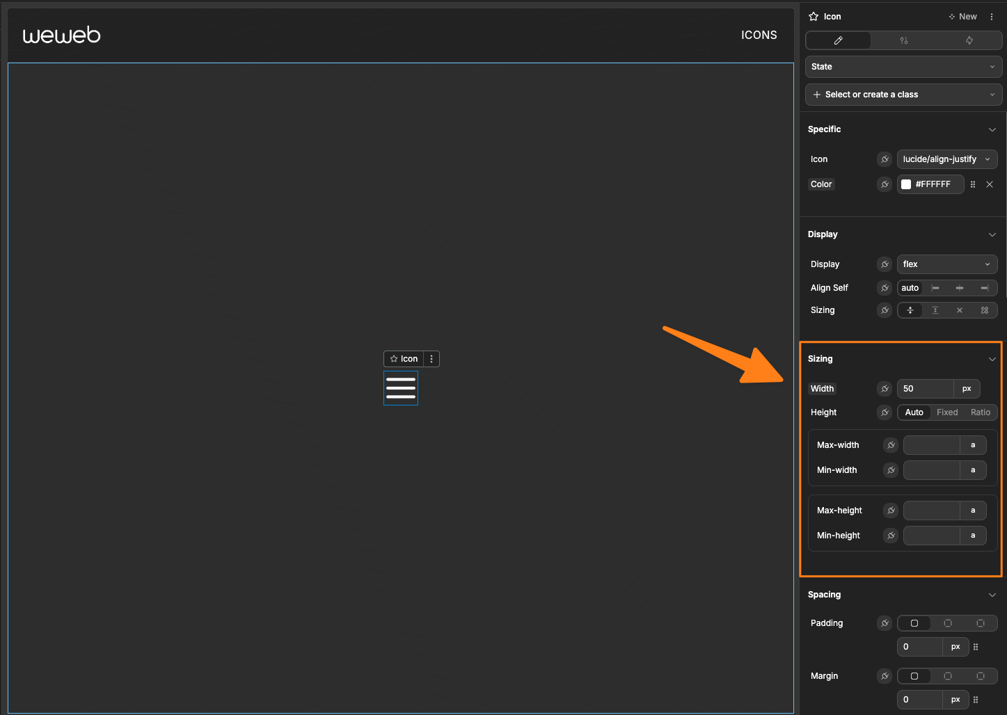
Sizing Icons
To change the size of an icon, you need to directly modify its height and/or width properties:
- Select the icon element
- Adjust the height and width values in the sizing properties panel
Adding Pre-made Icon Libraries
- Go to the
Assetsmenu in the top bar - Select
Icons - Go to
Manage icon sets - Add any pre-made libraries you want to use in your project
Managing Custom Icons
Uploading Custom Icons
- Navigate to the
Assetsmenu in the top bar - Select
Icons - Go to
Custom Icons - Upload your SVG files:
- Upload individual SVG files, or
- Upload folders containing multiple SVGs
WARNING
Custom uploaded icons must be SVG files, and must have their stroke and/or fill set to 'currentColor' for the color picker in the editor to work correctly. If you are unsure how to configure this, please refer to the video below:
Exporting Icons
From inside the Custom Icons menu, you can export all icons from your project.
Using Icons in Your Project
Selecting an Icon
Once you've added icons to your project:
- Add an Icon element to your page
- Use the icon selector in the properties panel to browse and select icons
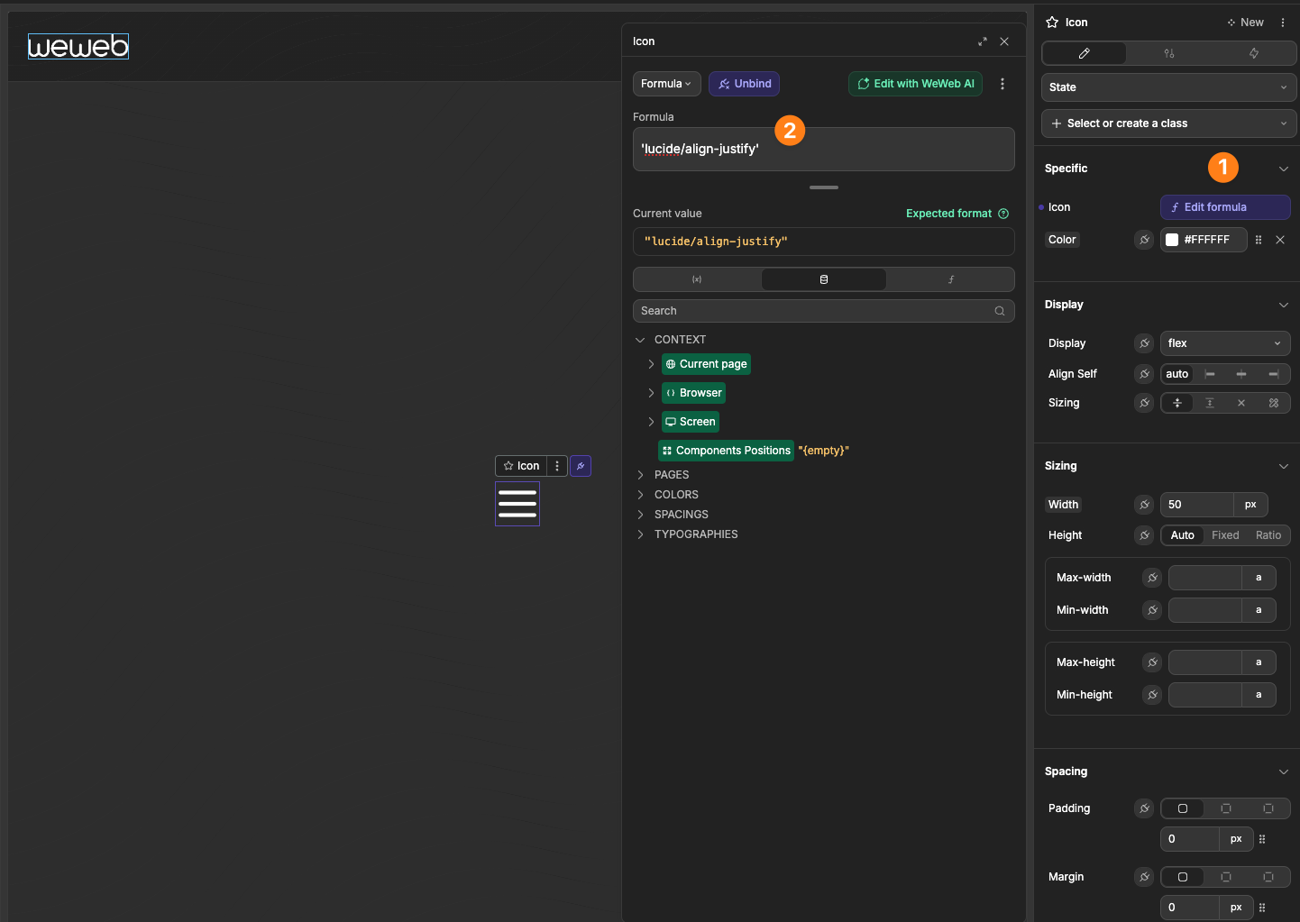
Binding Icons Dynamically
When binding an icon dynamically, you must use the exact name of the icon:
- An icon called 'align-justify' from the Lucide library would be
lucide/align-justify - A custom uploaded icon called 'check' would simply be
check
The syntax follows the pattern: libraryName/iconName for library icons, or just iconName for custom icons (assuming you have not manually added folders to the names of your of custom uploaded icons).
Important: Avoid Concatenation in Icon Paths
When binding icons dynamically, avoid using string concatenation in your icon paths. This can cause deployment issues, especially with GitHub.
Do: Use full icon paths in conditional statements
if(condition, "lucide/my-icon", "lucide/other-icon")Don't: Use concatenation with icon paths
"lucide/" + if(condition, "my-icon", "other-icon")The concatenation approach may work in the editor but can cause deployment failures when publishing to GitHub.