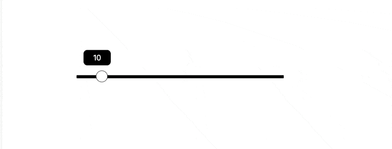
Appearance
Range Input
Incorporate a slider input into your web application to efficiently capture numerical values along a sliding scale.
Configuring Range Input
The Range Input element offers a variety of configurable properties to tailor its appearance and functionality.
Visual Properties:
| Property Name | Description |
|---|---|
| Tooltip | Enable or disable the tooltip display. |
| Font Size | Set the tooltip font size in pixels. |
| Font Family | Choose the font family for the tooltip text. |
| Active Range Background Color | Toggle the use of an active background color for the range. |
| Range Background | Define the color of the range background. |
| Selector Border | Specify the color of the selector's border. |
| Selector Background | Set the color of the selector's background. |
| Tooltip Background | Choose the background color for the tooltip. |
| Tooltip Text | Define the color of the tooltip text. |
Other Properties:
| Property Name | Description |
|---|---|
| Required | Enable or disable the requirement for this input in forms. |
| Initial Value | Set the default value for the range input. |
| Minimum Range | Define the minimum value of the range. |
| Maximum Range | Specify the maximum value of the range. |
| Step | Determine the increment step for the range values. |