Appearance
Image Slider
The image slider lets you showcase images in a carousel format. You can choose different transition effects, show navigation arrows and pagination bullets, enable autoplay, and even let users scroll with the mouse wheel. It works with manually added slides or bound data, so you can build simple image galleries or dynamic image slideshows.
Features
- Transition effects:
slide,fade,coverflow,flip, orcards - Controls: navigation arrows and pagination bullets
- Autoplay: optional looping and configurable timing
- Mousewheel: optional wheel control with sensitivity and direction options
- Dragging: control navigation by dragging or swiping
Getting Started
Using AI
The quickest way to set up the image slider is by using AI:
- Ask AI to add an
image sliderto your page. Mention:- the number of slides and image sources
- the transition
Effectyou prefer (e.g.,coverflow) - whether you want
Navigationarrows andPaginationbullets
- Ask AI to enable
Autoplayand setTiming(for example,5s). - Ask AI to style the slider height and position the navigation icons.
Example prompts:
- "Add an image slider with 3 slides showing product images. Use the coverflow effect with arrows and bullets."
- "Enable autoplay at 5 seconds and loop the slides."
Manual Setup
- Add the
Image sliderelement from theAddpanel. - Choose how to build slides:
- Add slides manually by clicking
+in the editor, or - Bind
Bind slidesto a collection or array to repeat slide layout with images.
- Add slides manually by clicking
- Set
Slides per viewandSpace betweento control layout on each breakpoint. - Pick an
Effectand setTransition duration(e.g.,800ms). - Turn
Navigationand/orPaginationon if you want arrows and bullets. - If desired, enable
Autoplay:- Turn on
Autoplay - Set
Timing(e.g.,3s–5s) - Optionally enable
Linear transition
- Turn on
- To allow mouse wheel control, enable
Mousewheel controland adjustSensitivityorInvert directionif needed.
Example Use Cases
Simple image gallery
- Add 3–5 slides manually and set an image source for each slide.
- Use the
slideeffect withNavigationandPagination. - Optionally enable
Loopfor continuous cycling.
Product showcase carousel
- Bind
Bind slidesto a list of product images from your collection. - Each slide will display the bound image automatically.
- Use
fadeorcoverfloweffect and enableAutoplaywith a5sdelay.
Full-width hero image slider
- Set the slider to
width: 100%and a fixed height (e.g.,600px). - Use
fliporcardseffect for visual impact. - Add custom navigation icons and position them absolutely on the sides.
Best Practices
Do:
- use
Slides per viewandSpace betweenresponsively for a great mobile layout - keep
Transition durationreasonable (e.g.,500ms–800ms) for smooth UX - enable
LoopwithAutoplayfor continuous, passive viewing - optimize your images for web to ensure fast loading
Don't:
- set very short autoplay
Timingthat makes images hard to see - use extremely large images without proper optimization
Forking
While the image slider offers extensive built-in options, you might want extra features. In those cases, you can fork the element and modify it to fit your needs.
If you are unsure how to fork an element, learn more in the dedicated documentation.
Properties Reference
Settings
| Property | Options/Type | Description |
|---|---|---|
Bind slides | array | Bind to a collection/array to repeat slide layout, or add slides manually |
Slides per view | number | Number of slides visible at once |
Space between | length in px | Space between slides |
Effect | slide fade coverflow flip cards | Transition effect between slides |
Transition duration | length in ms | Duration of the transition (e.g., 800ms) |
Navigation | boolean | Show/hide navigation arrows |
Pagination | boolean | Show/hide pagination bullets |
Loop | boolean | Enable continuous looping |
Autoplay | boolean | Enable autoplay |
Timing | length in s | Time between slides when autoplay is enabled (e.g., 3s) |
Linear transition | boolean | Use linear timing for autoplay transitions |
Mousewheel control | boolean | Enable mousewheel control |
Force to axis | boolean | Force scrolling along the slider axis |
Invert direction | boolean | Invert mousewheel direction |
Sensitivity | number | Adjust how sensitive wheel scrolling is |
Styling
This element does not have any specific styling properties.
Dropzones/Default Elements
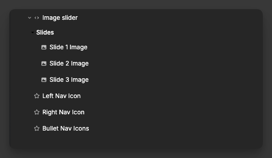
- Slides | Element: each slide contains an image element
- Left Nav Icon | Element: icon used for previous navigation
- Right Nav Icon | Element: icon used for next navigation
- Bullet Nav Icons | Element: icons used for pagination bullets
Event Triggers
This element does not emit custom events.
Exposed Variables
The image slider exposes the following variables for use in your application:
| Variable | Type | Description |
|---|---|---|
slideImageStates | object | Per-slide image loading states |
allImagesLoaded | boolean | Indicates if all images across all slides have successfully loaded |
TIP
You can use the allImagesLoaded variable to condtionally render the slider only once all images are loaded
Example Variable Values
slideImageStates
javascript
{
  "0": {
    "images": {
      "0": { "isLoading": false, "isLoaded": true, "hasError": false },
      "1": { "isLoading": false, "isLoaded": true, "hasError": false }
    },
    "loadedCount": 2,
    "loadingCount": 0,
    "errorCount": 0,
    "isLoaded": true,
    "isLoading": false,
    "hasError": false
  },
  "1": {
    "images": {
      "0": { "isLoading": true, "isLoaded": false, "hasError": false }
    },
    "loadedCount": 0,
    "loadingCount": 1,
    "errorCount": 0,
    "isLoaded": false,
    "isLoading": true,
    "hasError": false
  }
}
allImagesLoaded
javascript
trueTIP
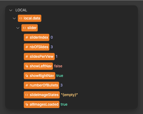
The slider also provides local context data inside the element and its slots (e.g., current sliderIndex, total nbOfSlides, visibility of navigation, and the number of bullets). These are only available inside the slider's images.